Improving the Bass Pro Shops product details page
Redesigned one of the site’s most-visited pages during the Bass Pro Shops and Cabela’s merger, lifting conversion 8.1%
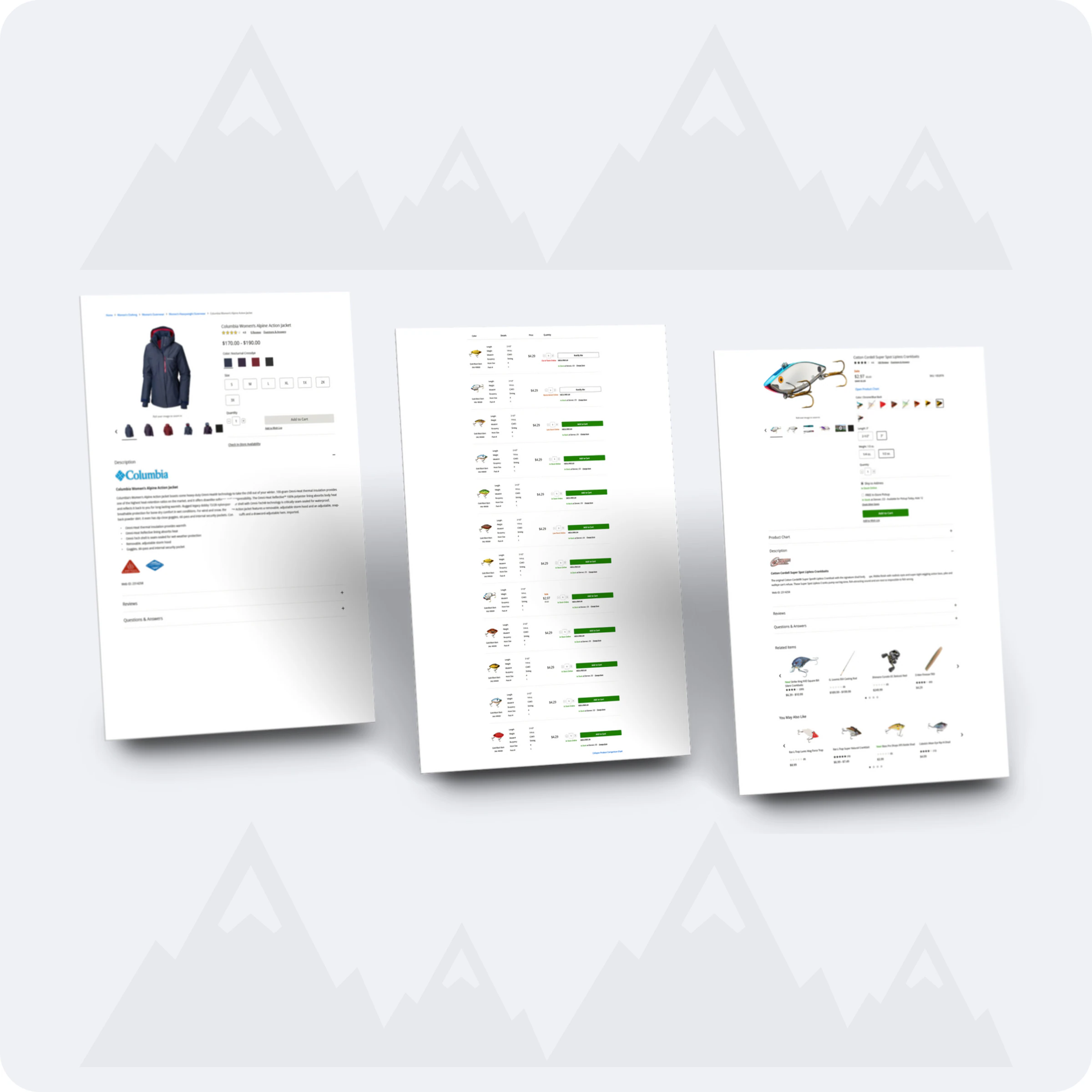
- My role
- Lead UX/UI designer and researcher
- Timeline
- Bass Pro Shops, 2018–2020
- Scale
- One of the highest-traffic pages on bassproshops.com
- Through the Bass Pro Shops and Cabela’s merger
- Tools
- Axure
- Sketch
- Analytics
- Platform
- Responsive web
Shoppers were abandoning one of our busiest pages because it offered too many ways to buy
Multiple buying options made an already confusing page too flexible, and messy product data and weak messaging made it worse. As one of the highest-traffic pages on the site, the product details page was losing a lot of shoppers.
The goal: a buying journey that feels like a modern e-commerce site, built around our personas, that raises conversion and order value while cutting abandonment and time on page.
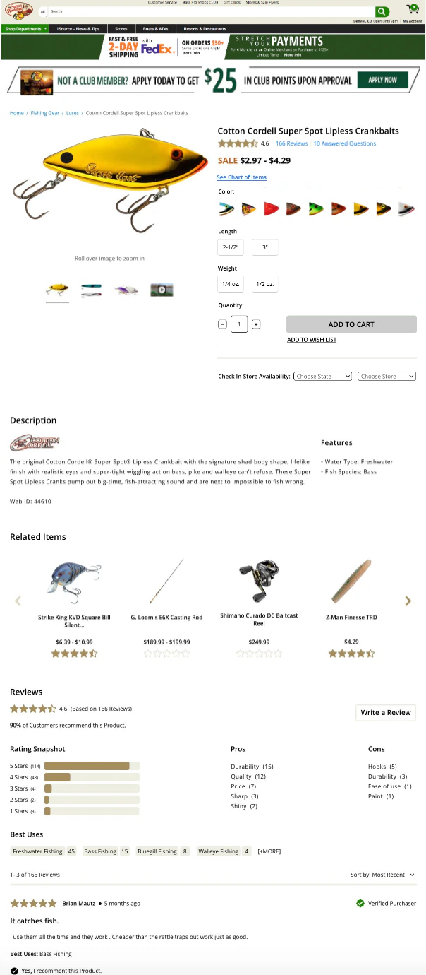
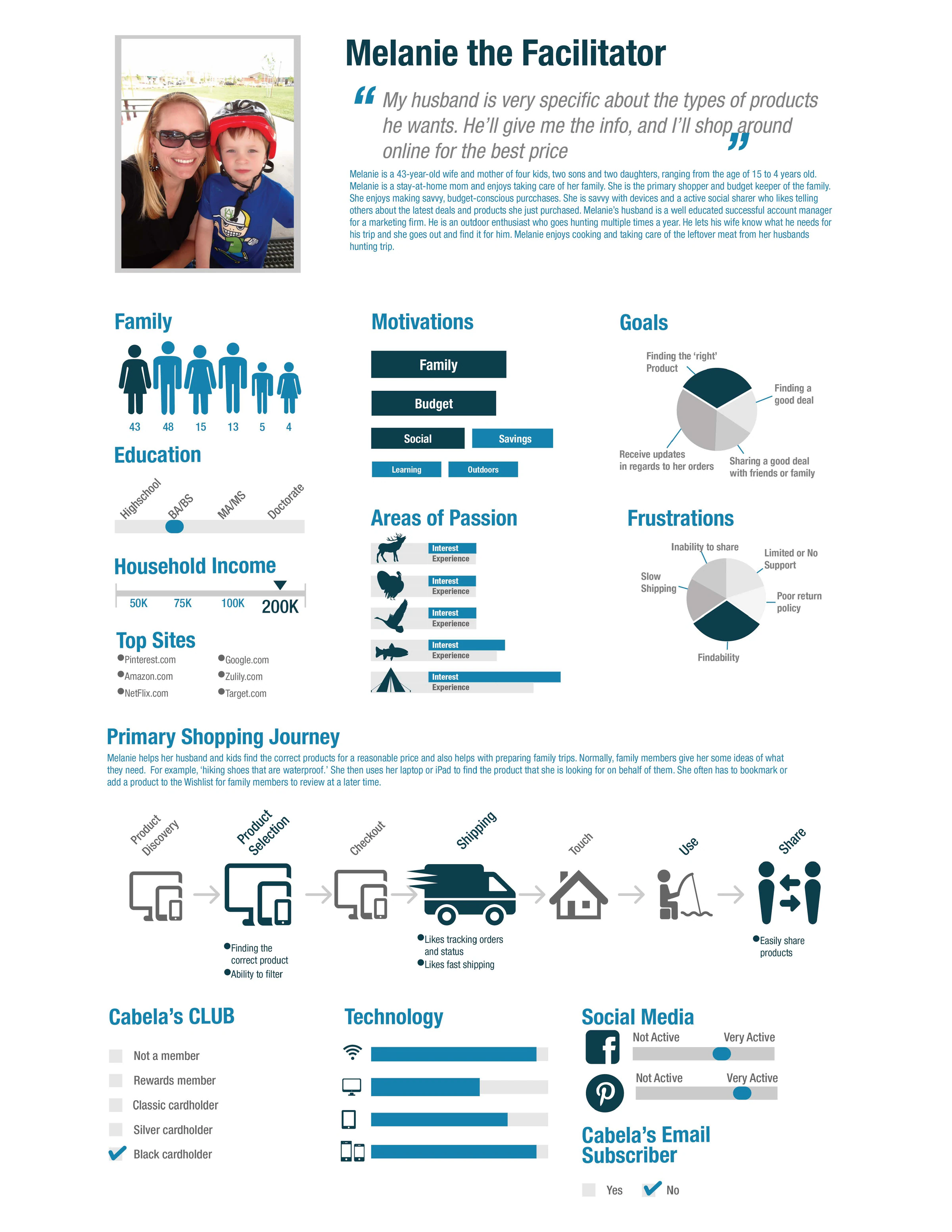
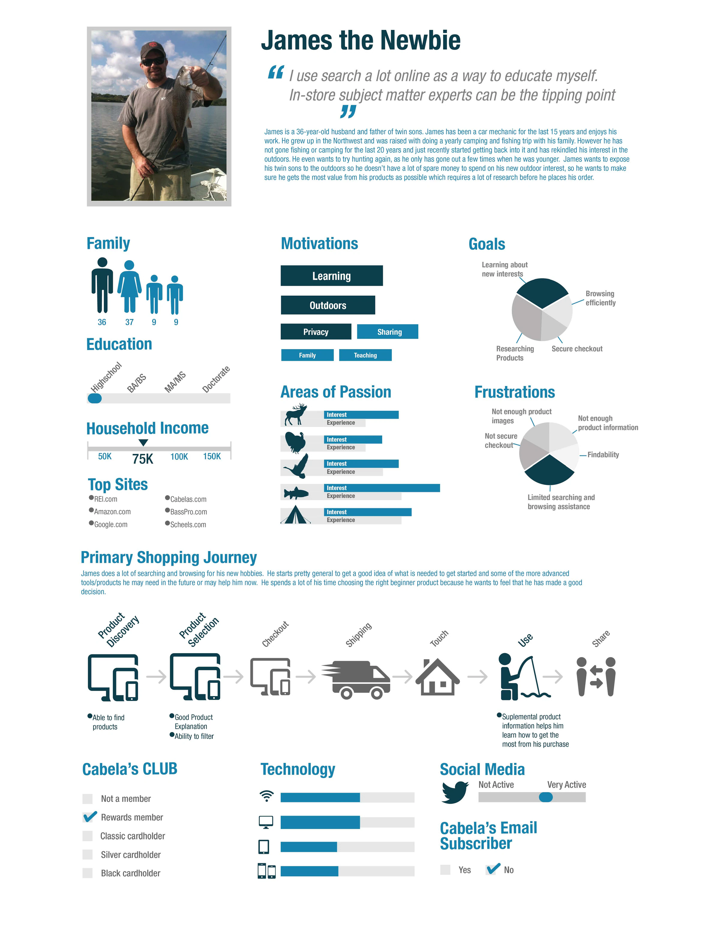
So I built four personas from common Bass Pro Shops use cases to see where the page failed them
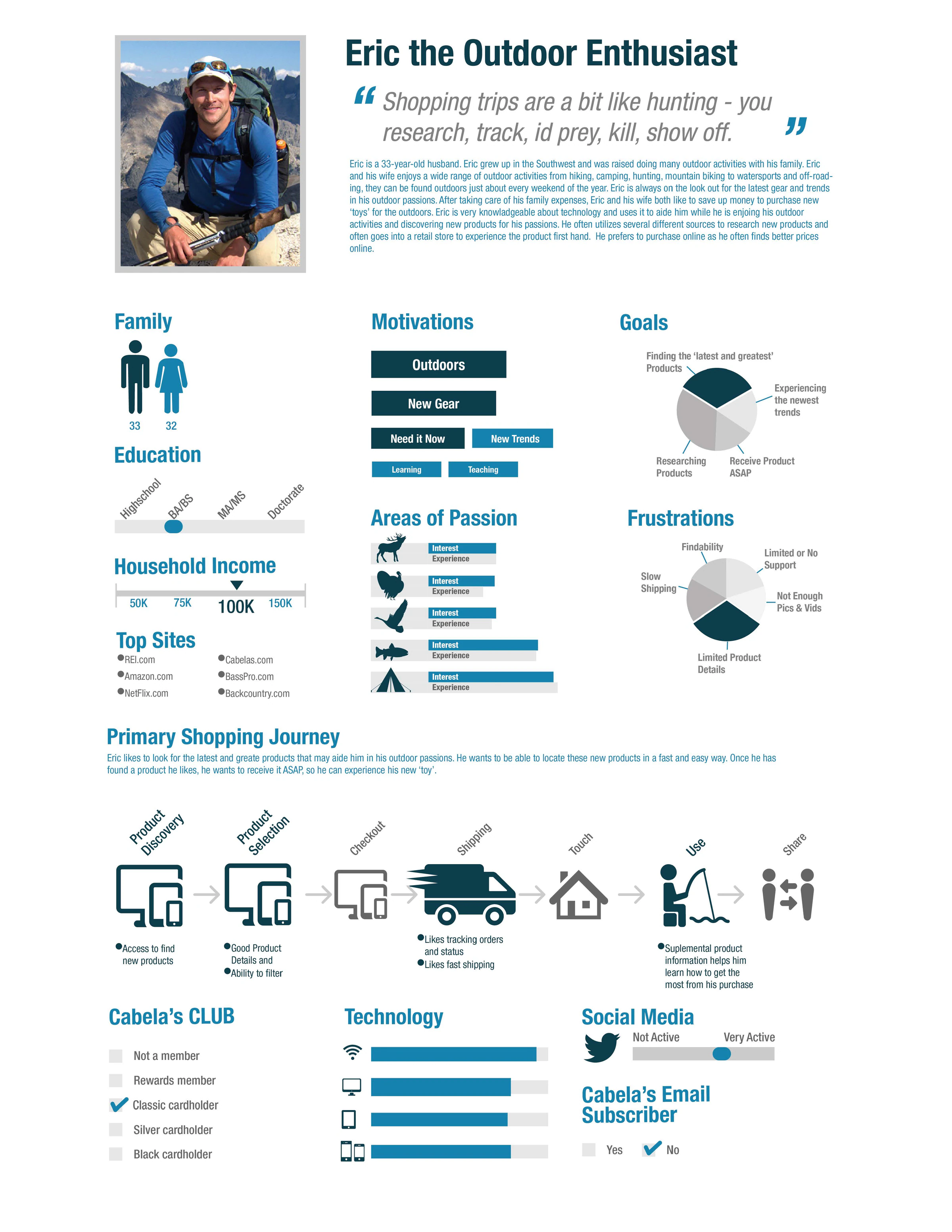
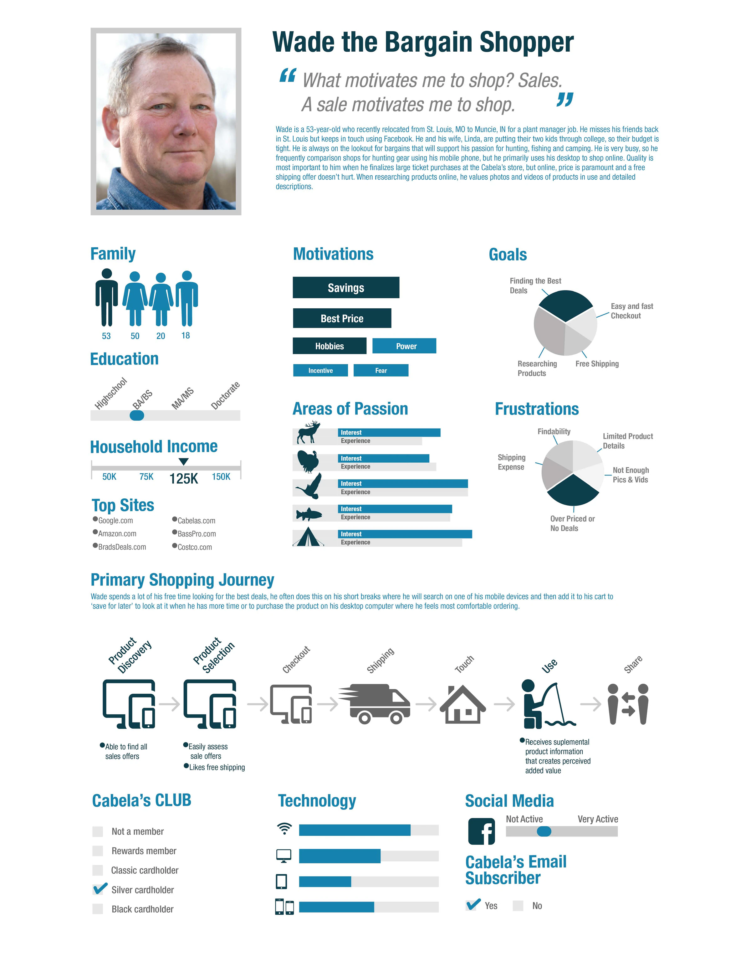

Then I tested an interactive desktop prototype with real shoppers
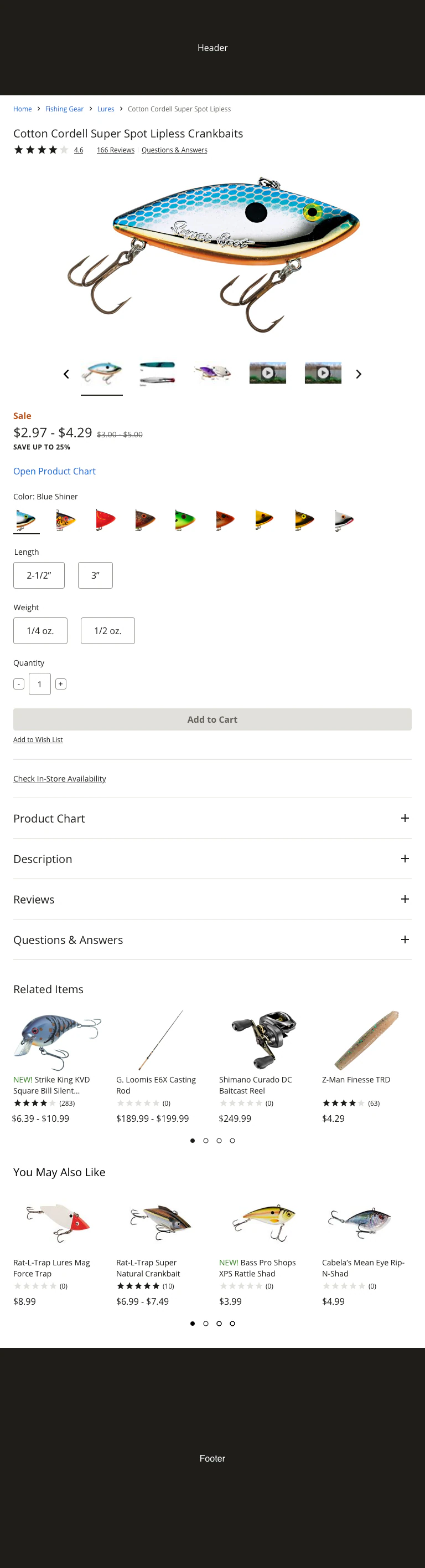
I tested simpler pricing, grouped images and video, separate charts and reviews, a dedicated reviews and Q&A page, and standard product selectors with “Sale” callouts.
I learned that simpler pricing and standard selectors made the decision easier
A price range was easier to read
Showing the range of prices helped people understand what they would pay and save.
Separate images, video, charts, and reviews
Grouping media and splitting charts from reviews matched what people expected and was easier to interpret.
Standard selectors worked everywhere
People recognized and used the same selectors across products. Overall, testers said they would recommend Bass Pro Shops to a friend.
The final page simplifies pricing and puts the details people need in the order they need them


Phase 1 cut bounces by more than a quarter, and phase 2 held the gains
Measured in production after each phase. We kept monitoring and improving after launch.
More shoppers who landed on a product bought it.
Far fewer people left the page right away.
Higher conversion turned into revenue.
Phase 2 kept improving it, with conversion up 5.5%.