A long-term vision for HubSpot’s pricing pages
Turned research with customers and sales reps into a pricing-page vision, then tested it into a 10% lift in paid conversion
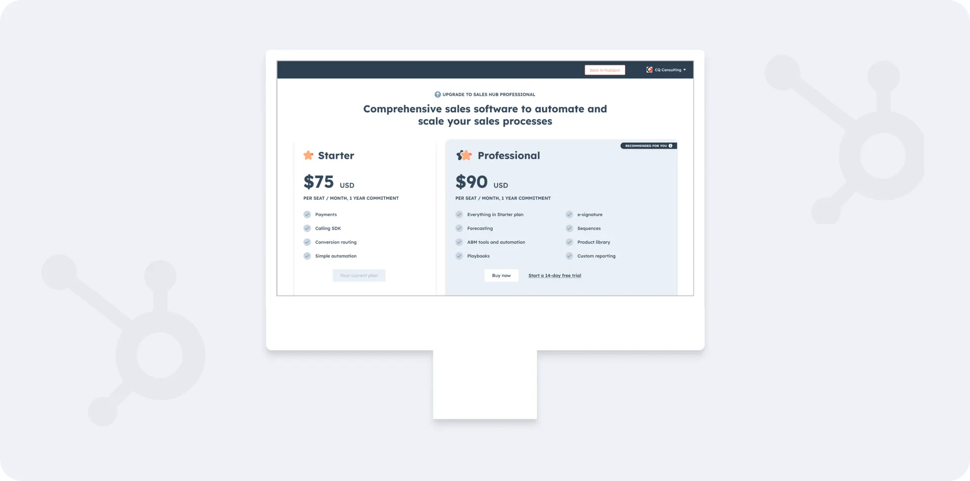
- My role
- Design lead, Growth: pricing and monetization
- Timeline
- HubSpot, 2022–2025
- Scale
- Public and in-app pricing pages
- Every HubSpot plan, from free to Enterprise
- Team
- Sales reps (roundtable)
- Pricing and packaging partners
- Tools
- Figma
- Amplitude
- User interviews
- Platform
- Web (public site + in-app)
The pricing page had to serve two kinds of buyers, and it was not serving either one well
HubSpot sells two ways: small teams buy on their own through free and lower-cost plans, and larger companies buy premium plans through a sales rep. The pricing page has to steer both to the right path.
I set out to make it clear, concise, opinionated, and scalable.
- Clear: easy to understand and compare HubSpot’s products
- Concise: transparent without overwhelming people
- Opinionated: use data to match customers with the best plan and purchase path
- Scalable: reusable components and templates so updates can become self-serve
Grow the number of customers on the lower end through free plans and self-service purchase.
Grow value per customer on the upper end through premium plans guided by a sales rep.
So I talked to customers and sales reps, and audited how competitors present pricing
- 01InterviewedCustomer interviews and a sales-rep roundtable
- 02AuditedCompetitor pricing pages
- 03AnalyzedChat transcripts from the pricing page and page analytics
I learned people were overwhelmed, missing whole plans, and asking sales to choose for them
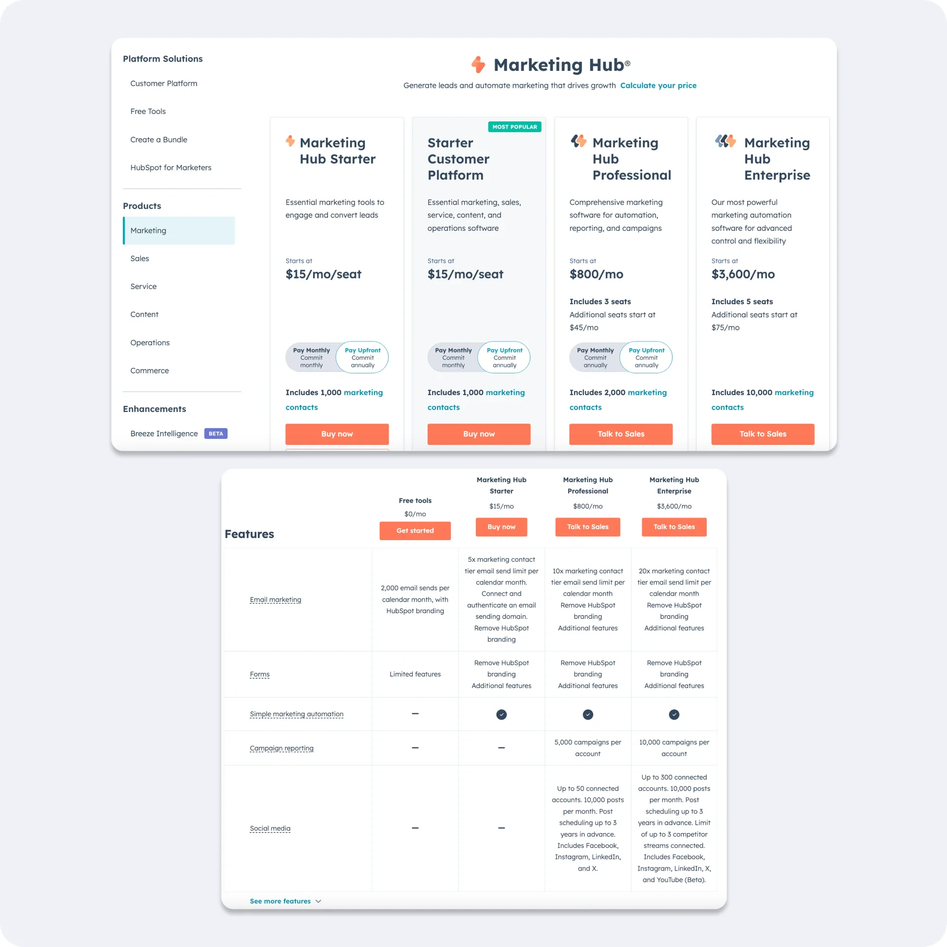
The feature table was too much
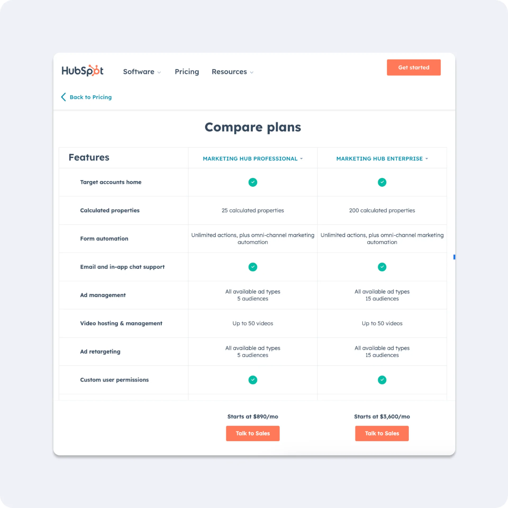
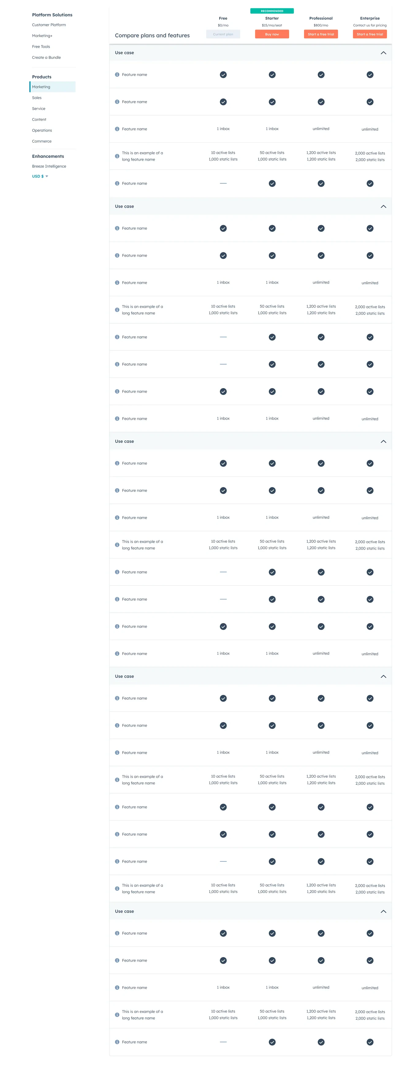
HubSpot averaged 70+ features per table with no grouping; competitors averaged 50, grouped by use case. In interviews, people stopped scrolling before reaching the differences between plans.
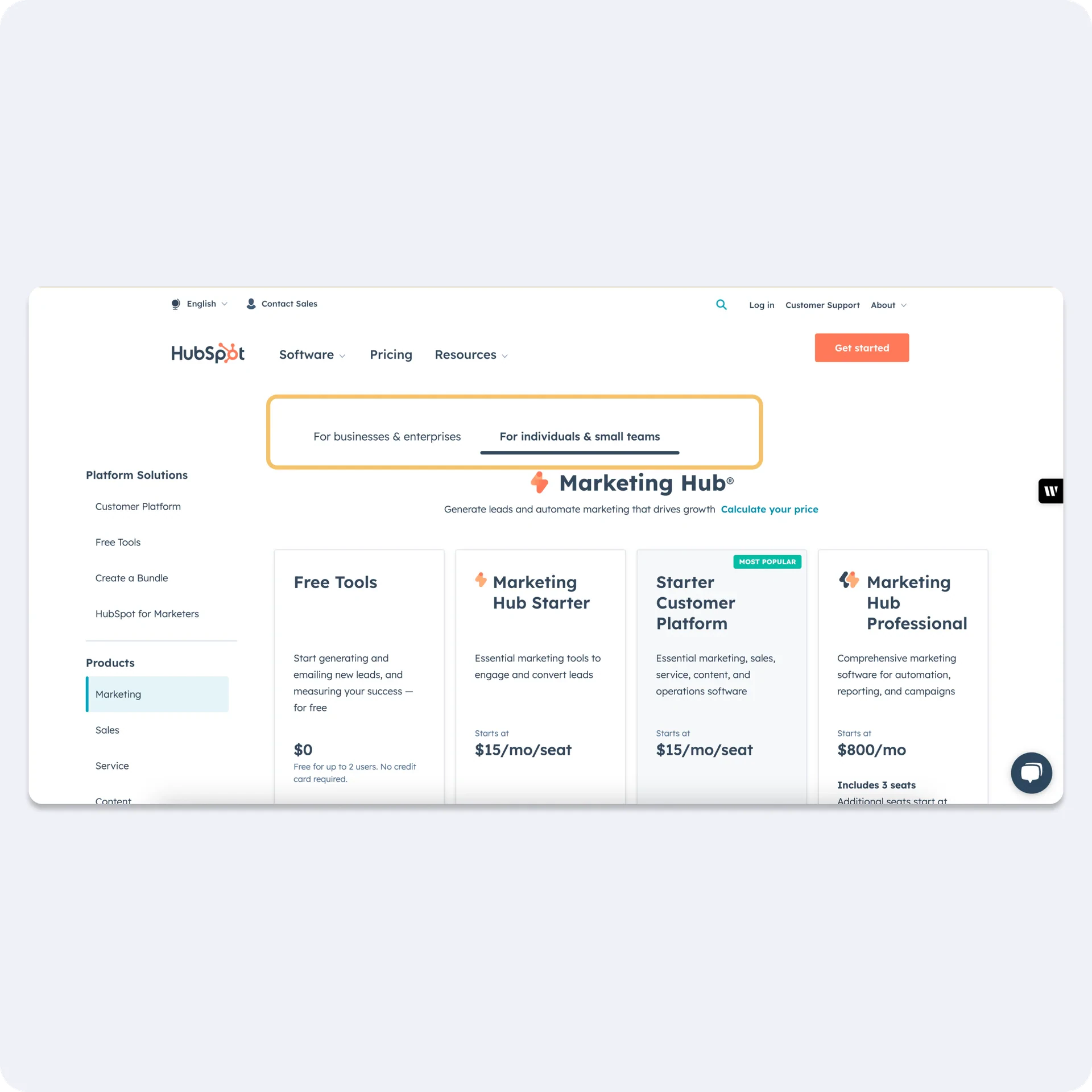
Tabs hid our cheapest plans
Only 24% clicked the tab with Free and Starter. Half of interview participants did not notice we had a free plan. Chats asked: “Is there a free plan?”
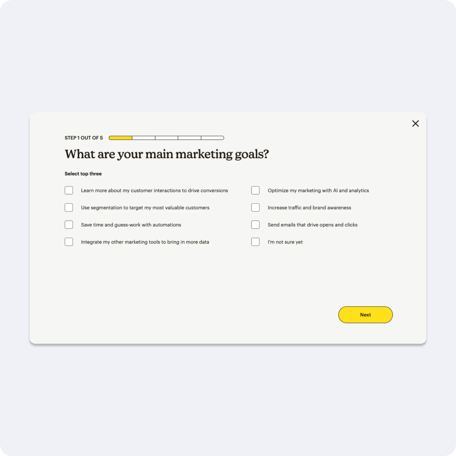
Sales reps wanted a plan quiz
60% could not explain the difference between a hub and a tier, and Compare Plans had a 1.3% click-through. 2 of 3 rep groups asked for a quiz that matches people to the right plan.
Then I turned the research into three opportunities and a vision for each
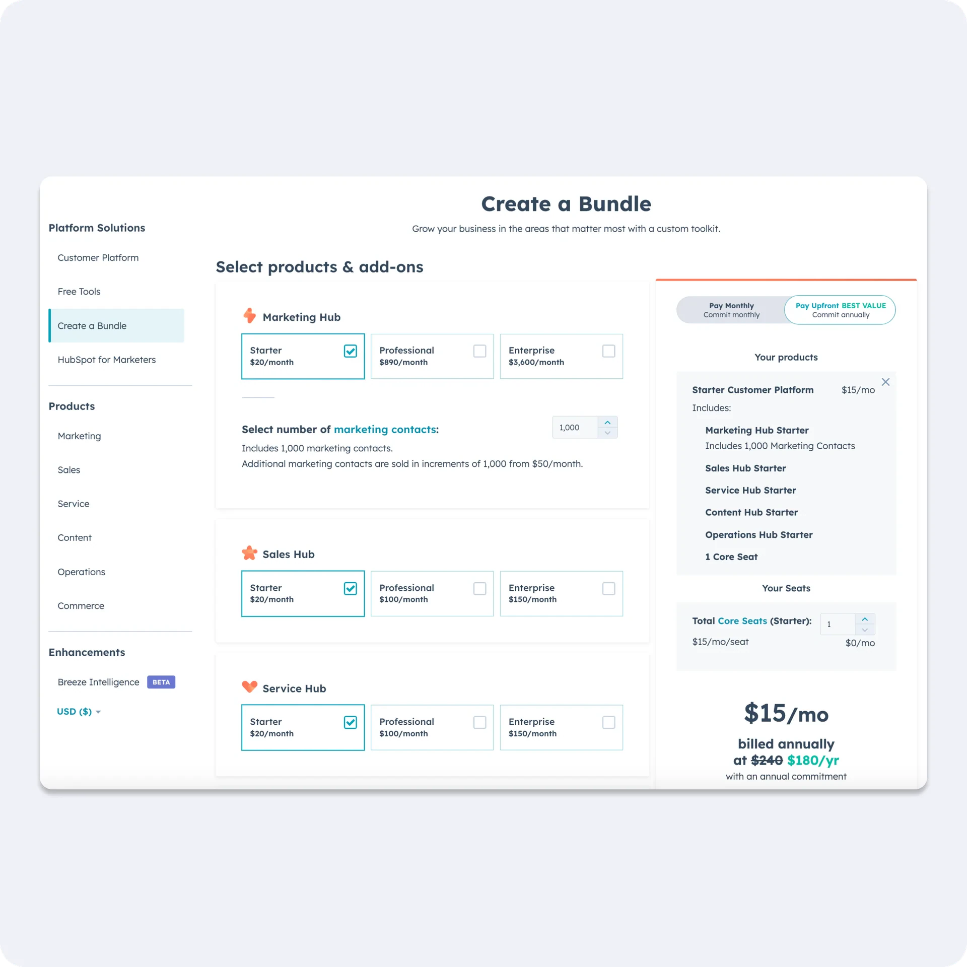
Show every plan on one page with “starting at” pricing, and move configuration to checkout. Organize feature tables into collapsible categories. Recommend plans with a quiz instead of handing people a menu. And build reusable templates so simple pricing changes become self-serve for our partners.
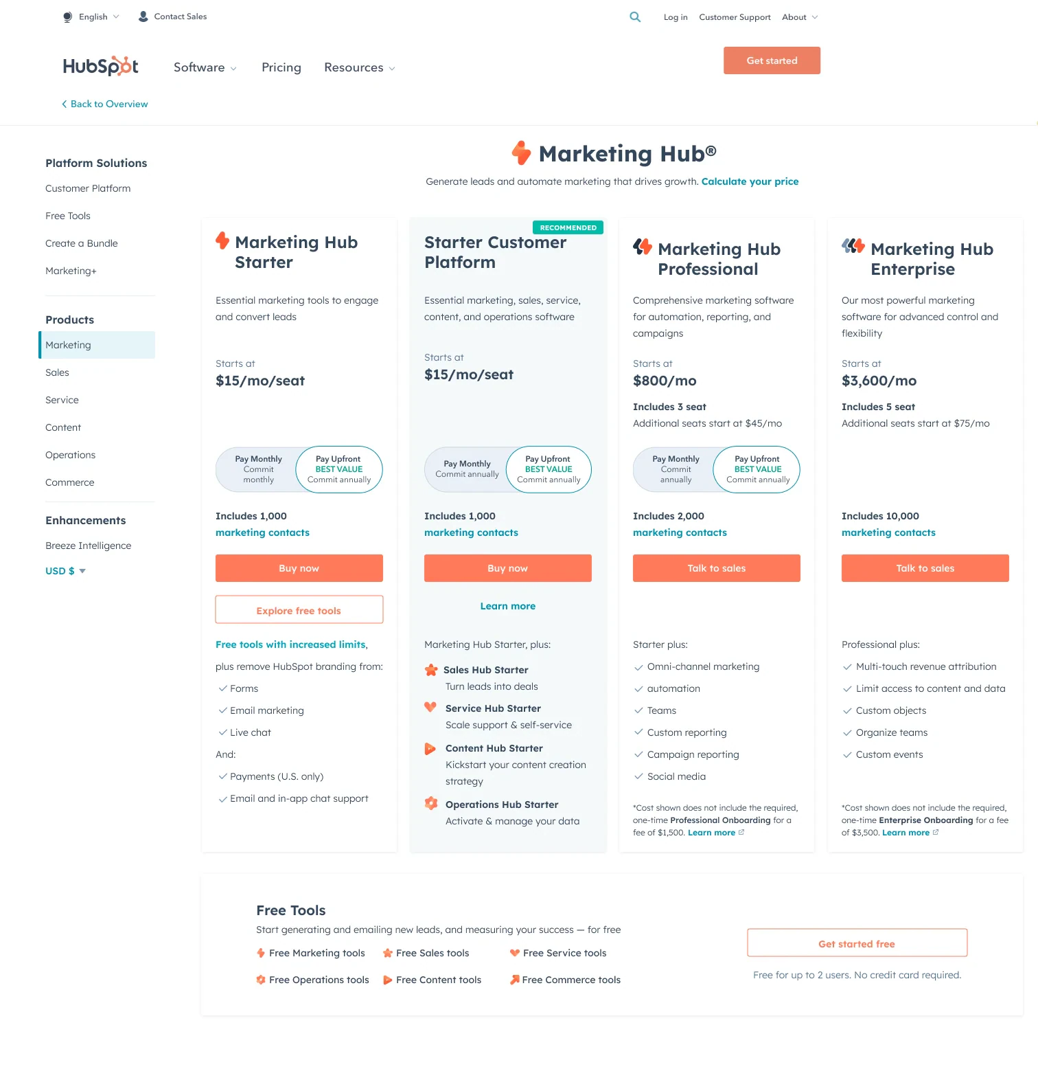
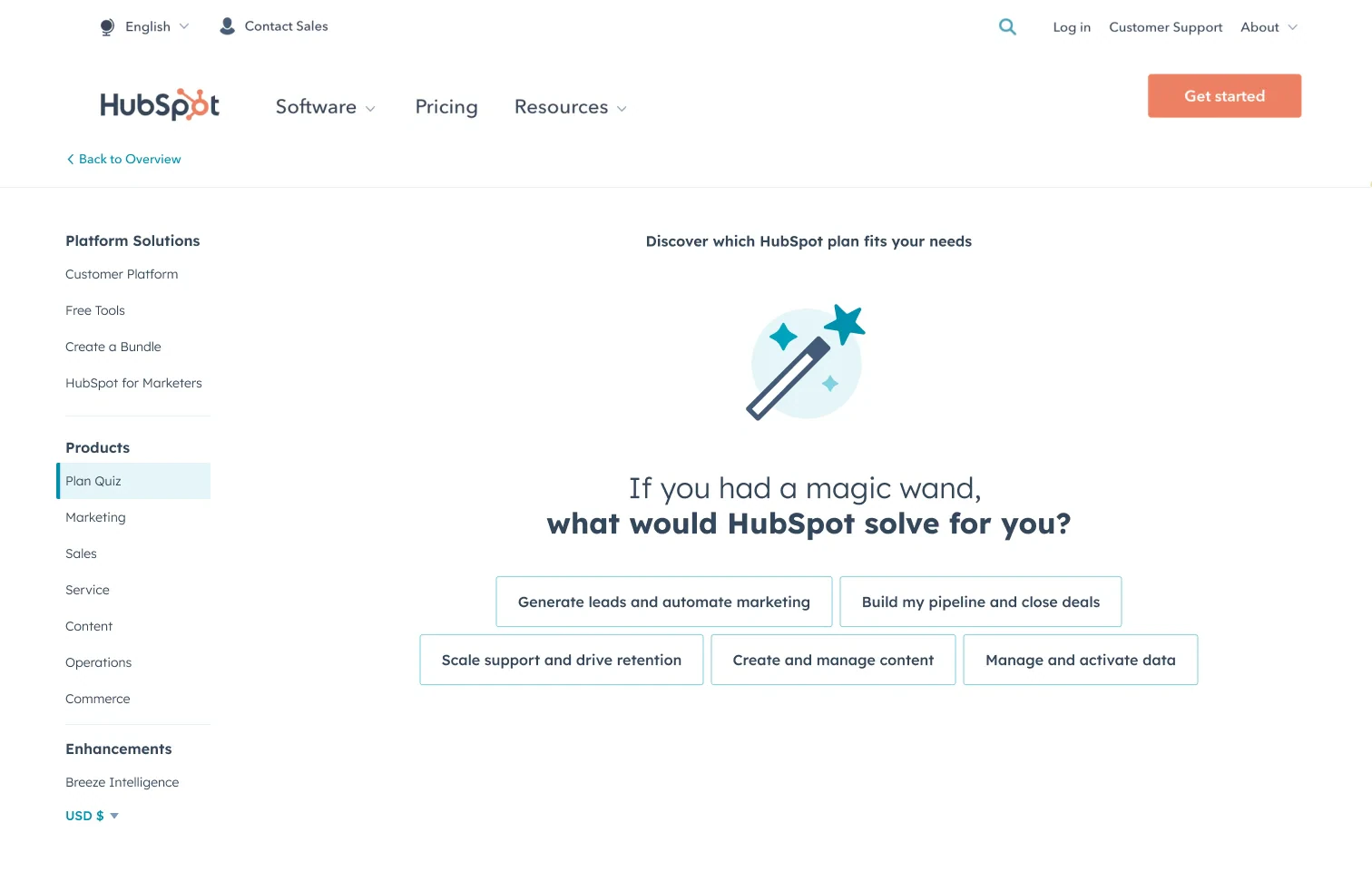
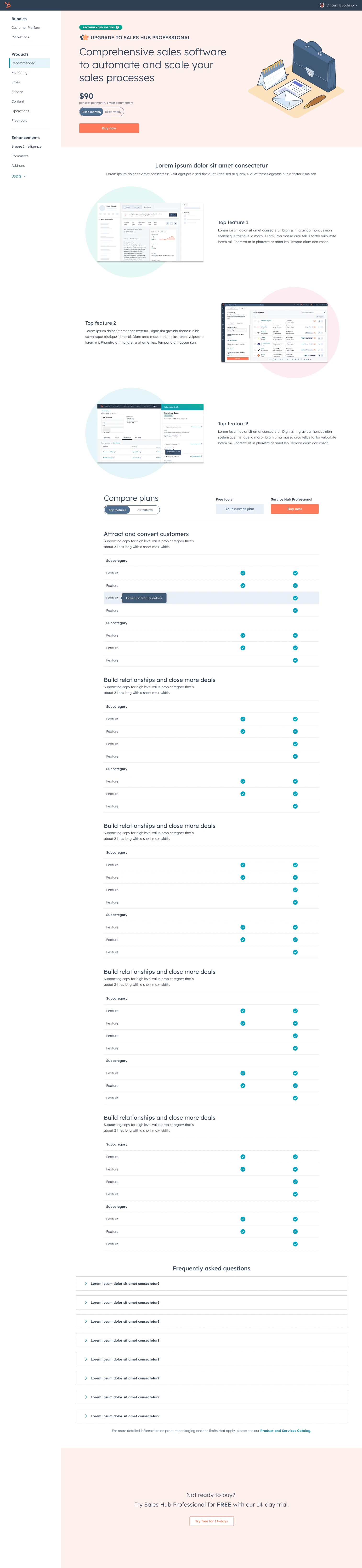
When showing every plan cost us free sign-ups, I paired transparency with a recommendation
I tested the vision piece by piece instead of shipping it all at once.
Cut Tabs that hid Free and Starterto protect plan transparency
Buy Now clicks rose 35% and revenue per view rose 9.8%, but free sign-ups fell 3%, so we added plan recommendations to keep both.
Cut Total-cost calculations on the pageto protect clarity
Directional “starting at” pricing up front, with full configuration and the final price in checkout.
I planned the work in horizons so the pricing pages could evolve without breaking sales workflows
Some changes would affect how sales reps sell. We agreed to explore alternatives with them first, and set the North Star as e-commerce revenue, never at the expense of overall revenue.
- Horizon 1Modernize
Modernize the current pricing page experience with a full redesign.
- Horizon 2We are hereSimplify
Cut excess information and comprehension friction through experimentation.
Create a playbook for pricing page components and requests.
- Horizon 3Optimize
Optimize every pricing page with stronger, more opinionated recommendations.
Build self-service templates so product teams can ship their own pricing page requests.
The experiments that came out of the vision moved real revenue
From the winning bundle-card placement, with a 68% shift toward the full-platform bundle.
From a new seats configuration experience.
When all plans became visible on the public pricing page.
Same test: more people found the plan that fit them.
I made pricing changes easier for the teams who depend on them
Sales reps
Brought them into the research so the quiz could also collect info before discovery calls.
Engineering
Documented pricing patterns, states, accessibility, and localization guidance as design system ambassador.
Pricing partners
Created rules and templates so simple requests like banners could become self-serve.
- Kept the North Star on e-commerce revenue without hurting overall revenue
- Tested the vision in small experiments instead of one big redesign