Revamping Rite Aid’s account creation and dashboard
Redesigned sign-up so every tester created an account without errors, and most also joined Rewards
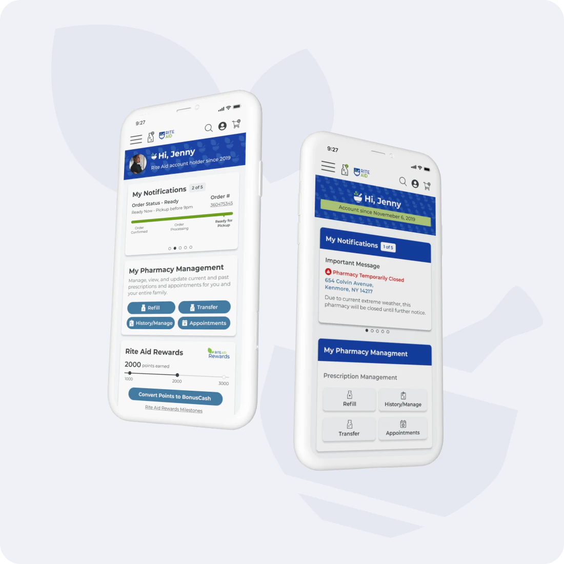
- My role
- Lead UX designer and strategist, managing junior and mid-level designers
- Timeline
- Rite Aid, 2020–2022
- Scale
- Account holders shop 2× more often
- and buy 1.4× more than guests
- Team
- Junior and mid-level designers I managed
- Product
- Stakeholders
- Tools
- Figma
- Platform
- Responsive web + mobile
Rite Aid’s account holders spent far more, but creating an account was harder than it needed to be
Account holders shop 2× more often, buy 1.4× more, cross-shop 1.4× more, and abandon less. Yet sign-up had many entry points, and the dashboard did not help people finish the task they came for.
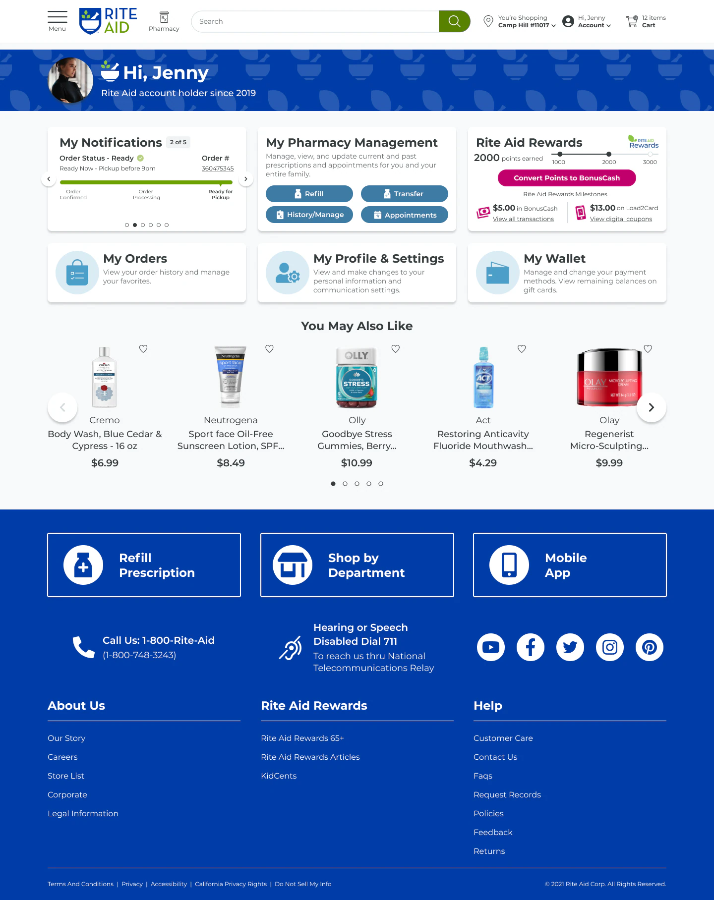
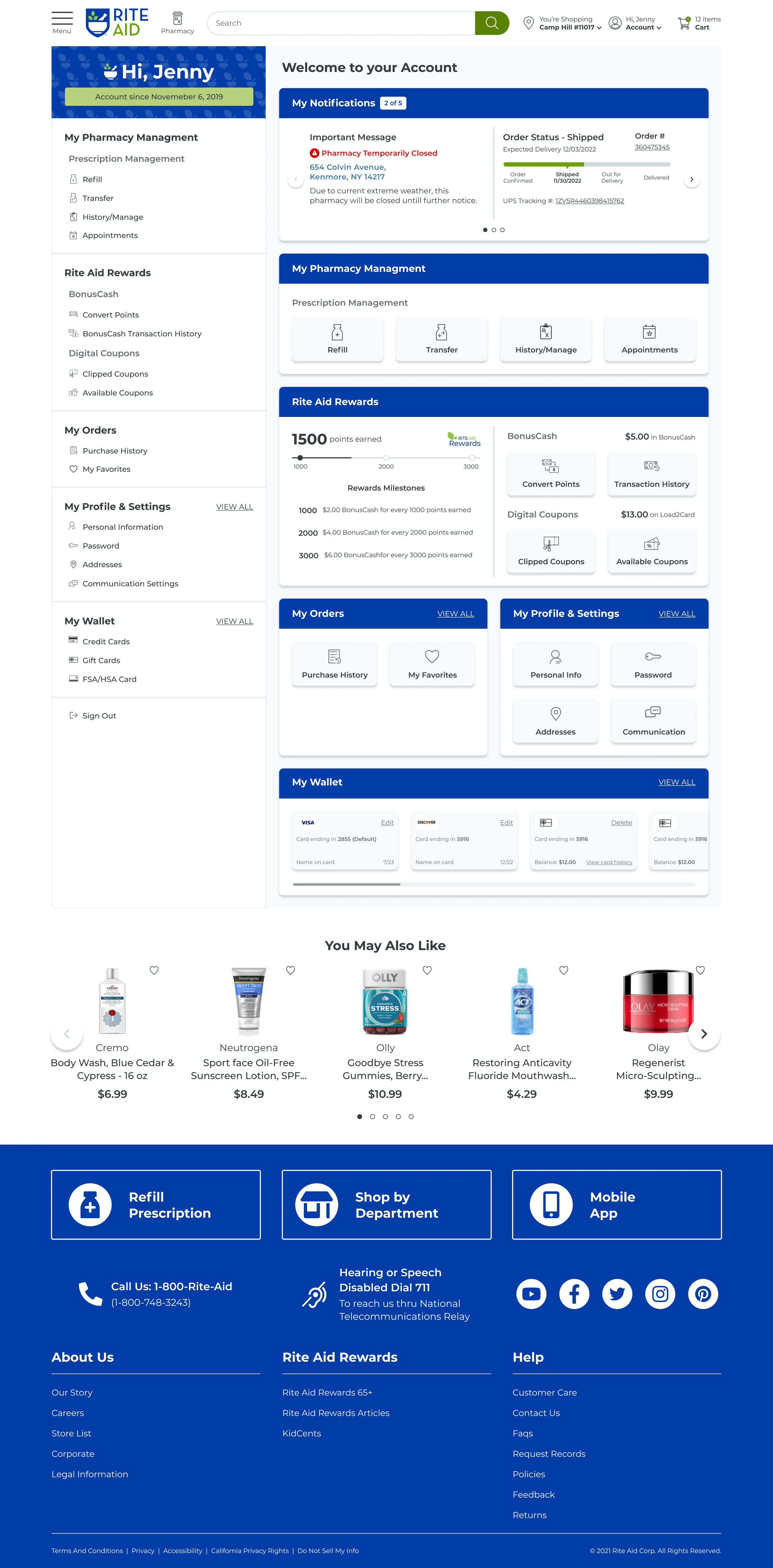
People never browse an account page for inspiration. They come with a specific task, so the dashboard had to work as a true home base that points them to their next best action.
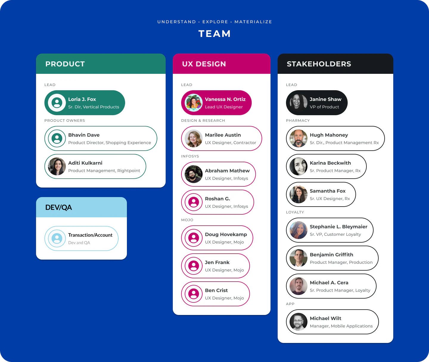
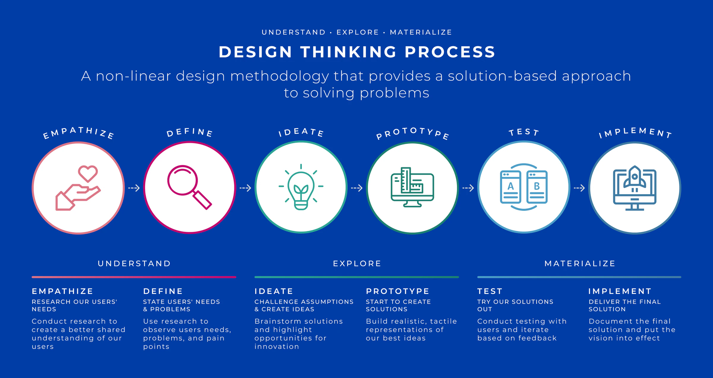
So I led my team through personas, journey maps, and a competitor audit to see sign-up through customers’ eyes
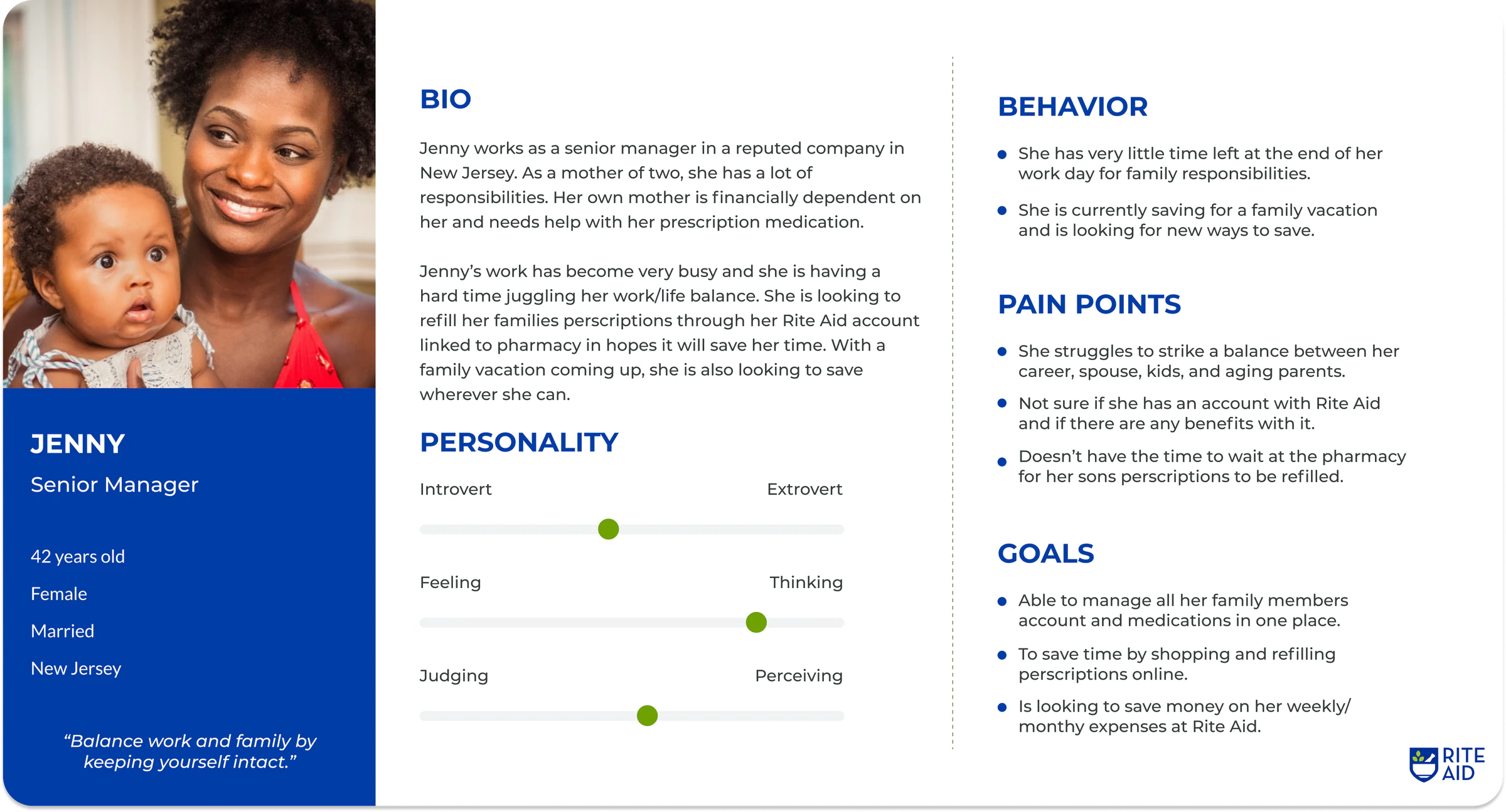
- 01Empathized3 personas and empathy maps from common Rite Aid use cases
- 02MappedCustomer journey maps of account creation
- 03ComparedPrimary and secondary competitor sign-up and dashboards
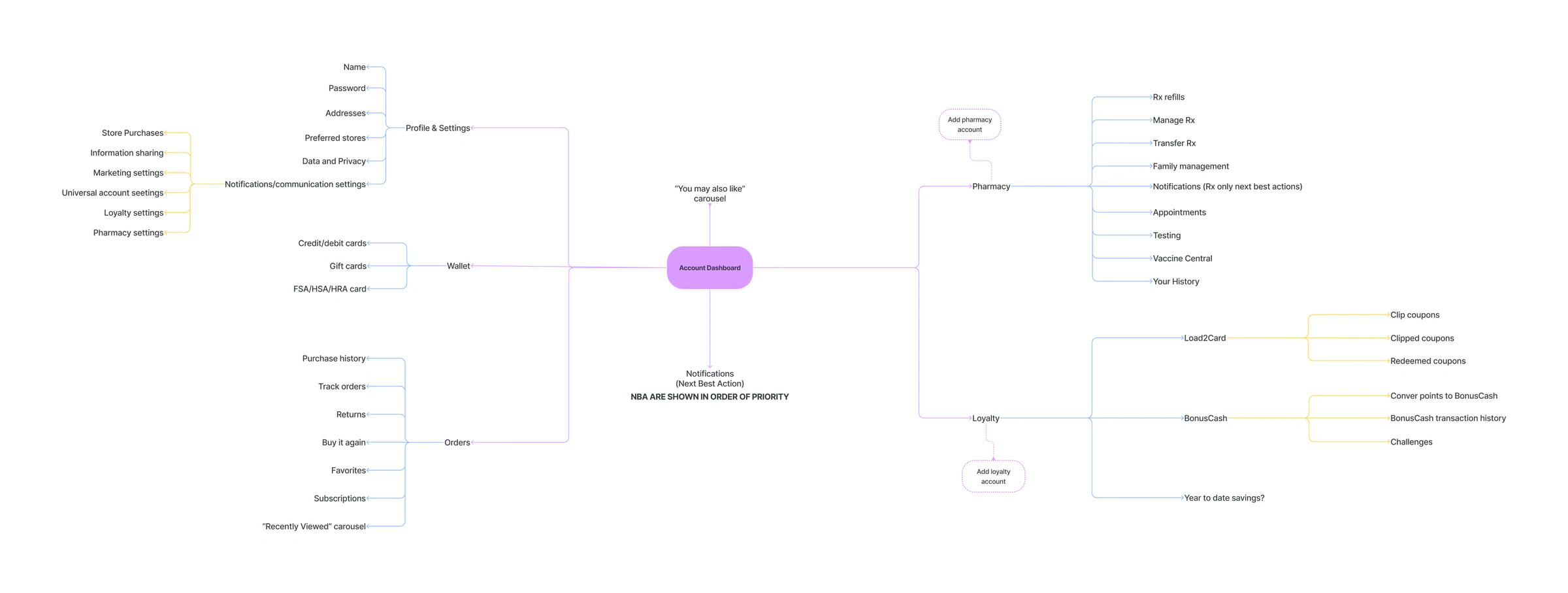
- 04StructuredMind map of the whole account structure
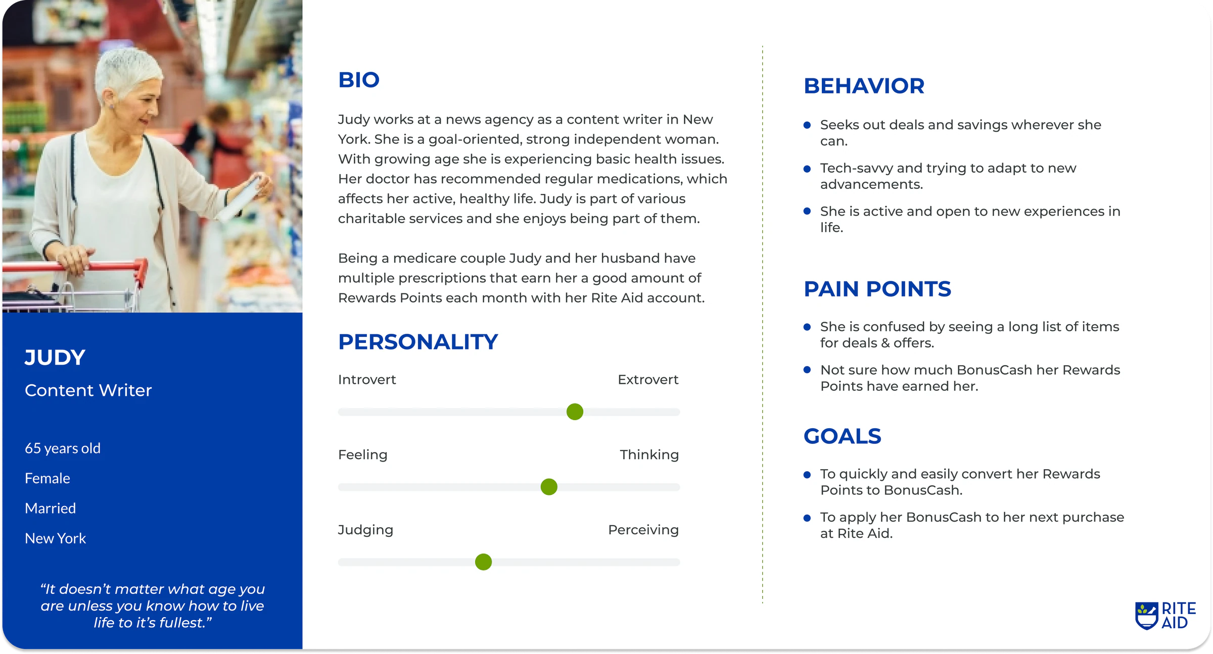
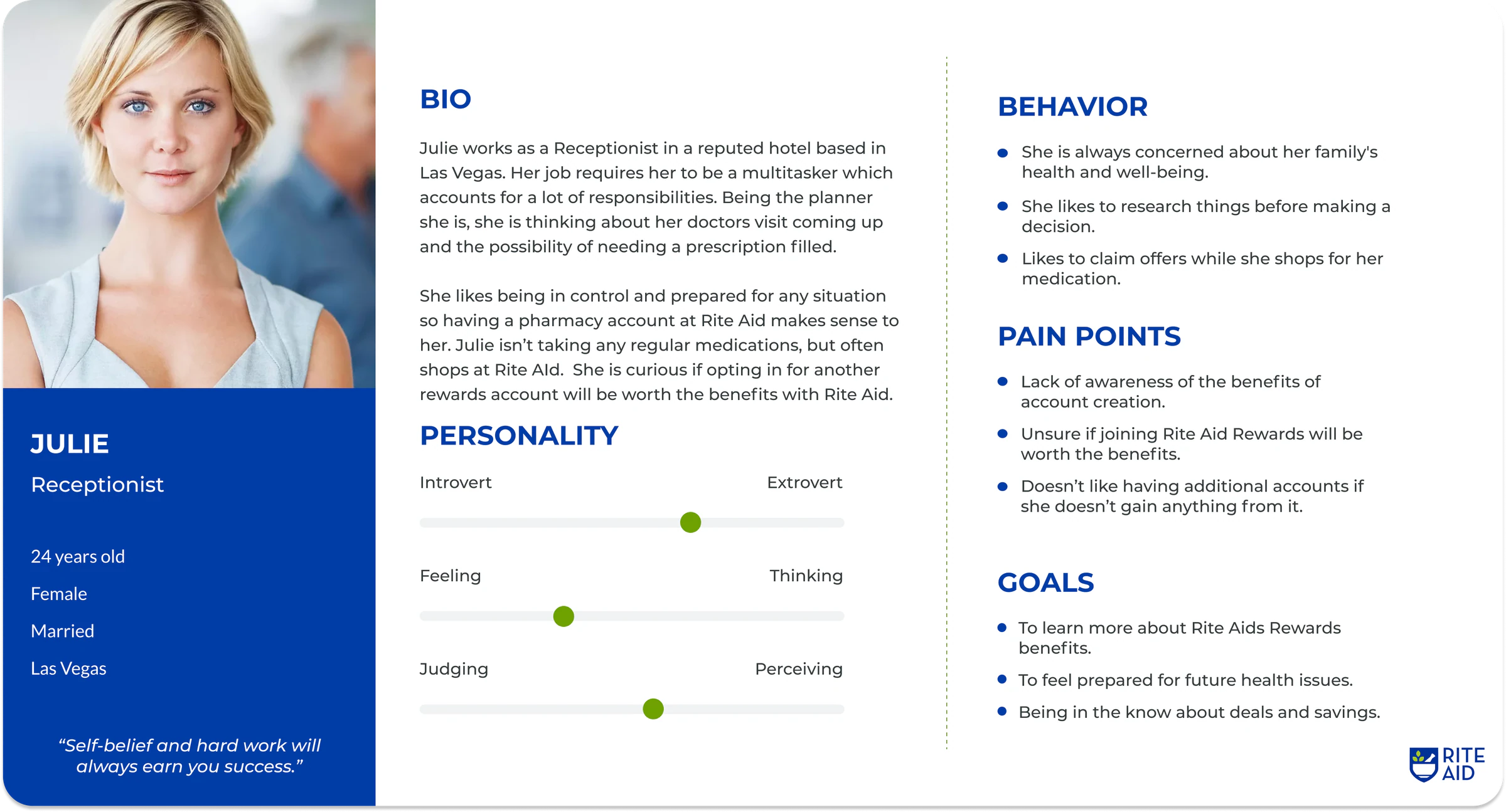
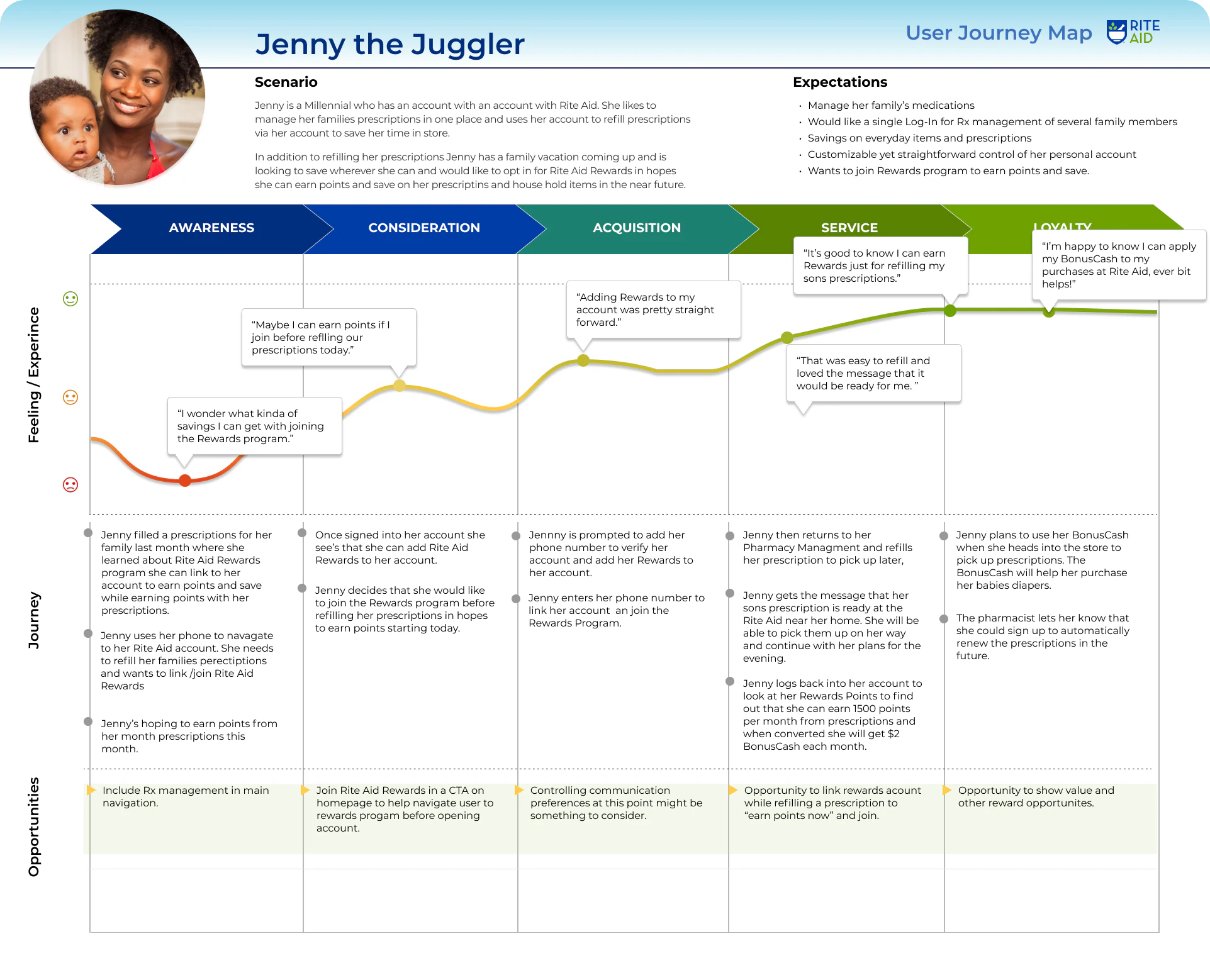
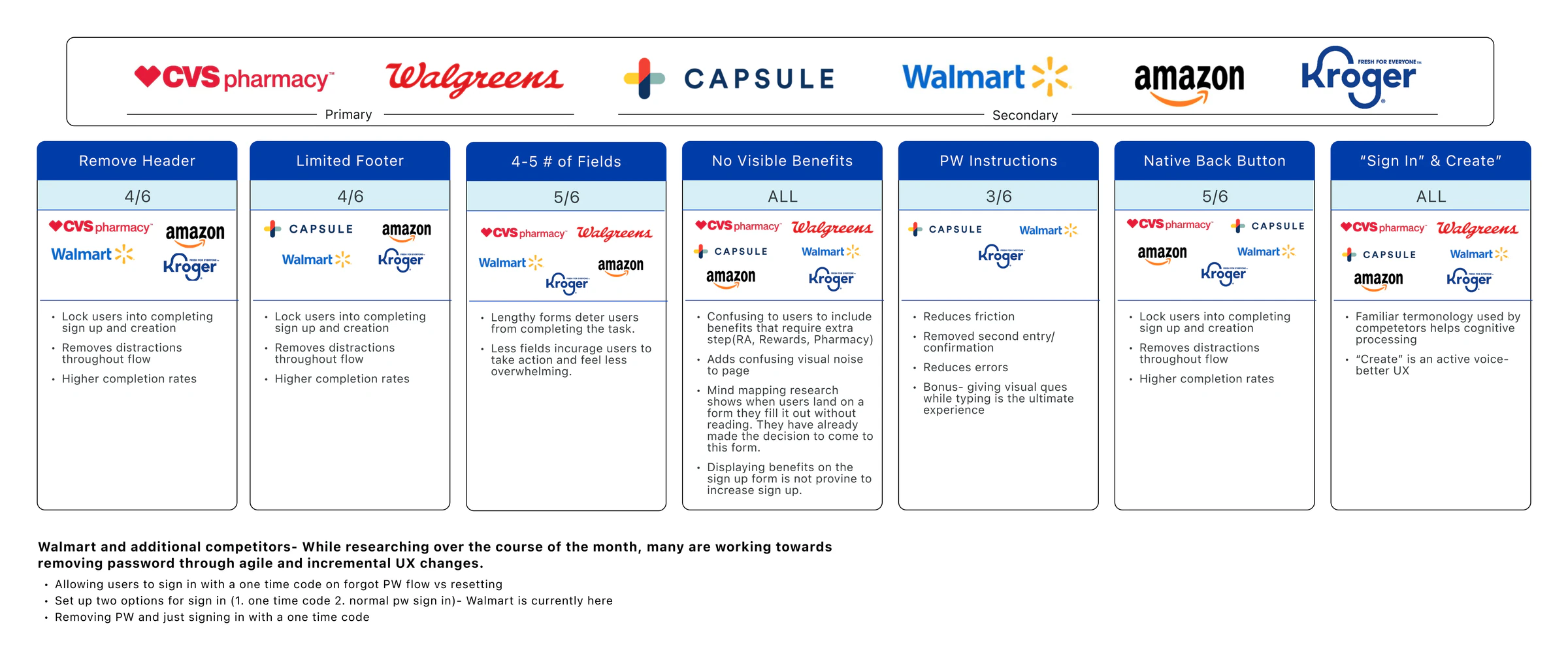
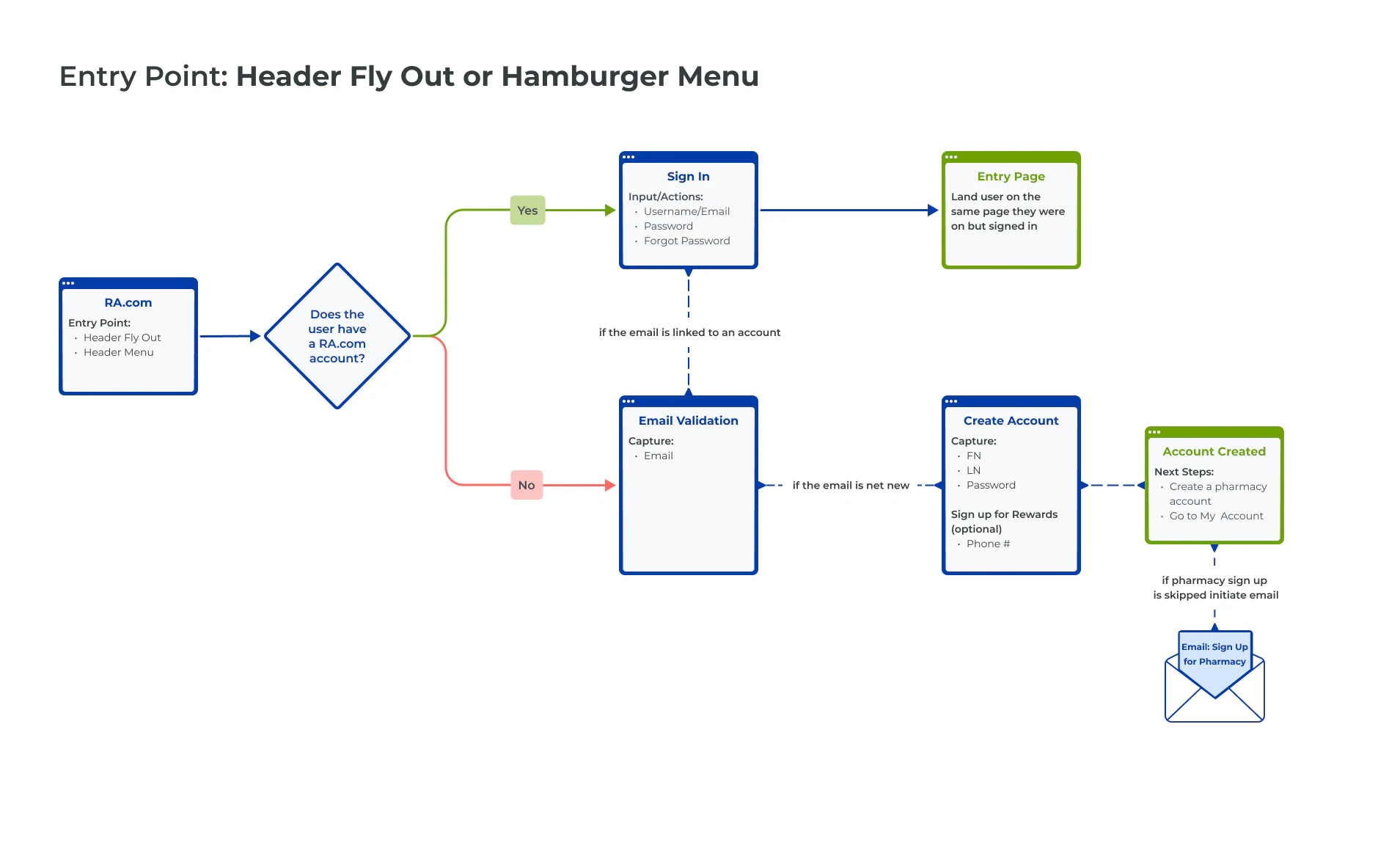
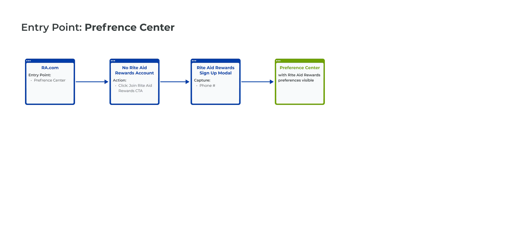
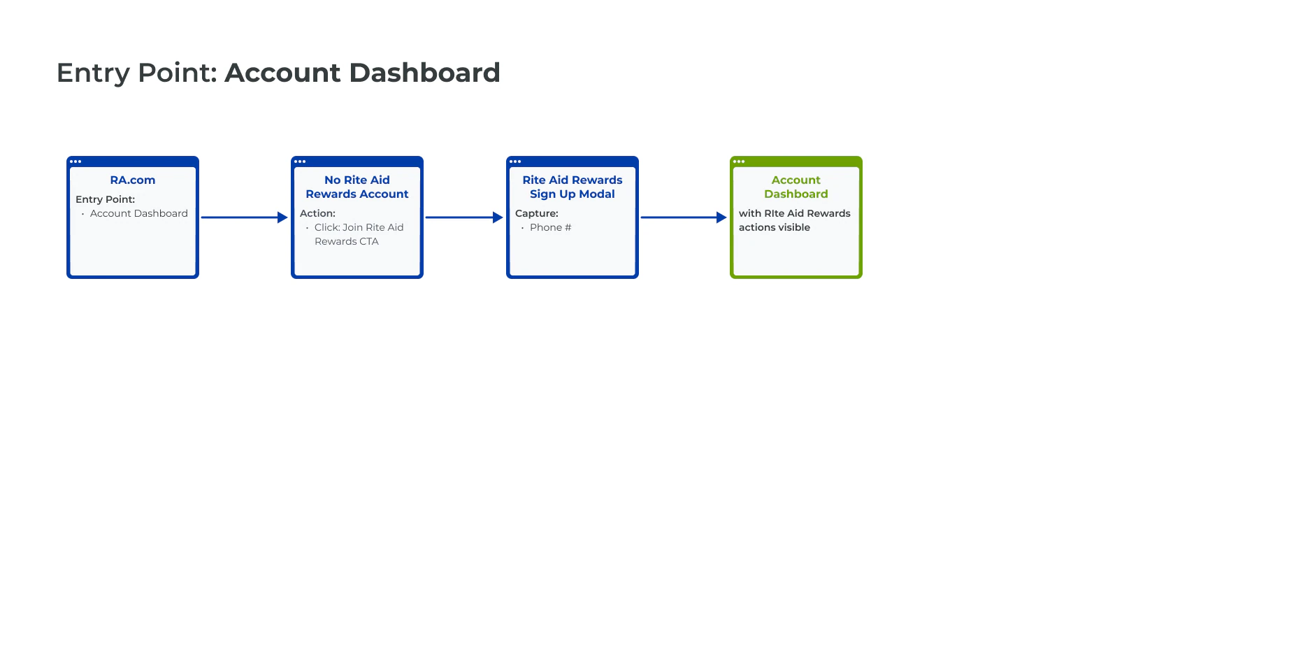
Then I mapped every way a customer can land in sign-up, so one fix worked everywhere
A mind map of the account structure and user flows for each entry point showed how to simplify the journey without breaking the paths people already used.
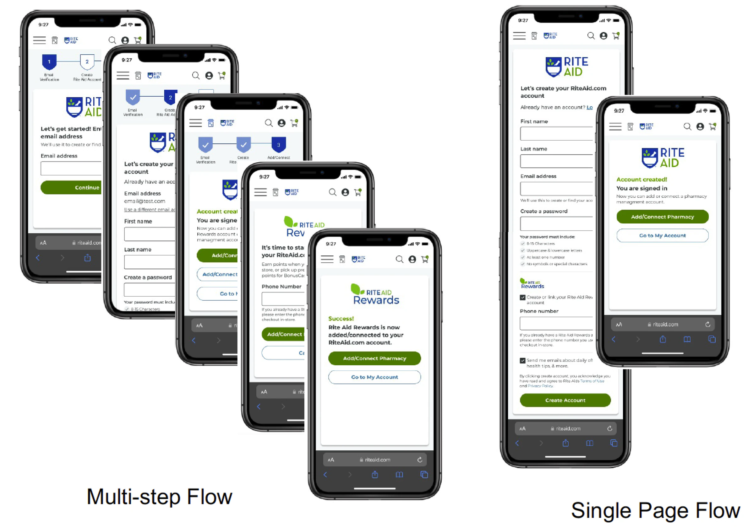
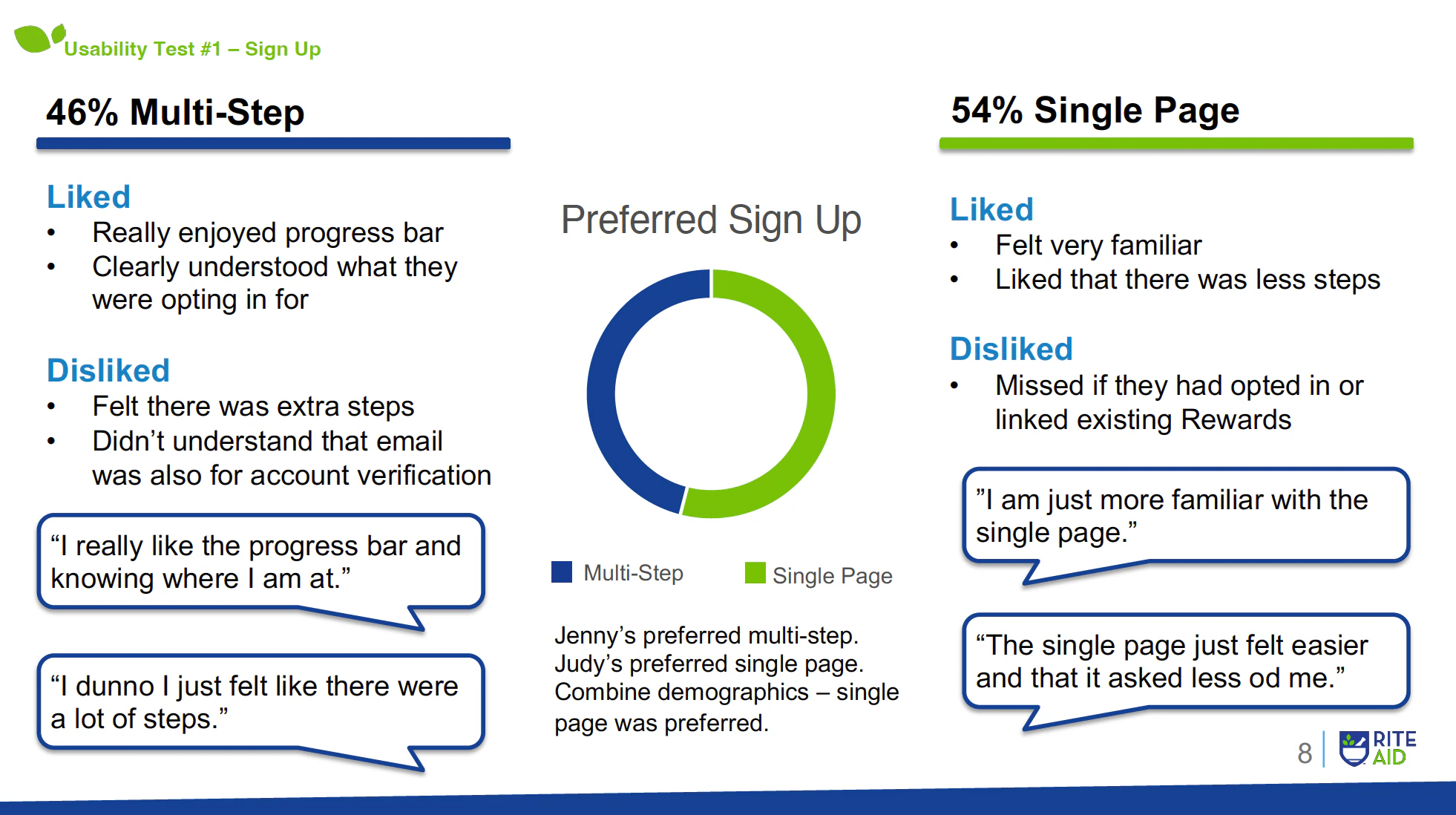
I tested a multi-step sign-up against a single page, then kept the best of each
The multi-step version gave each area its own page with a progress bar. The single page combined account and loyalty sign-up. The final design took the email verification from multi-step and the familiar single page.
The final sign-up verifies email first, fits on one page, and opts people into Rewards
Email verification first helps people who already have an account. A single page feels like fewer steps. Rewards is pre-selected to increase linked accounts. And a progress bar shows where you are, which testers liked.
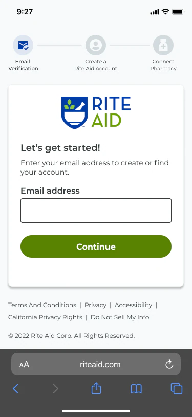
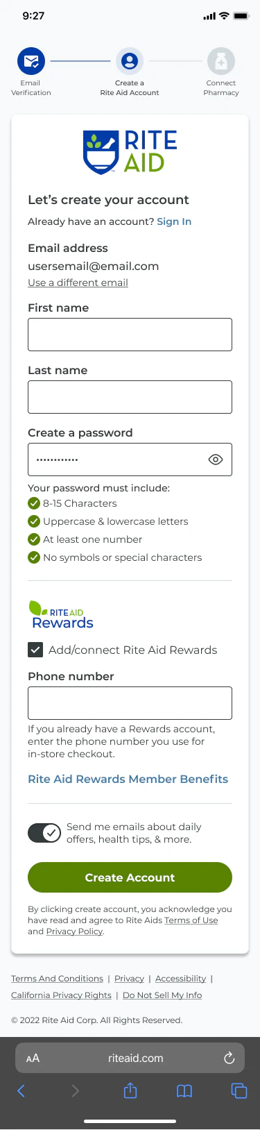
In testing, people found the new sign-up easy, familiar, and trustworthy
Final-design usability testing. The dashboard A/B test (left nav vs. cards) was still pending when this was written.
Every participant created an account without errors or friction.
Completed account creation and Rewards sign-up with very little effort.
Said creating an account was a good experience.
Also: familiar 80%, intuitive 70%, trustworthy 70%.
I grew my designers while we shipped
Junior and mid-level designers
Led the UX strategy and directed their work across research, flows, and final designs.
Product and stakeholders
Set up the dashboard as an A/B test so the data, not opinions, would pick the layout.
- Tested two competing flows before committing to either
- Validated the final design with usability testing before launch