Making the upgrade to HubSpot’s Starter CRM Suite an easy decision
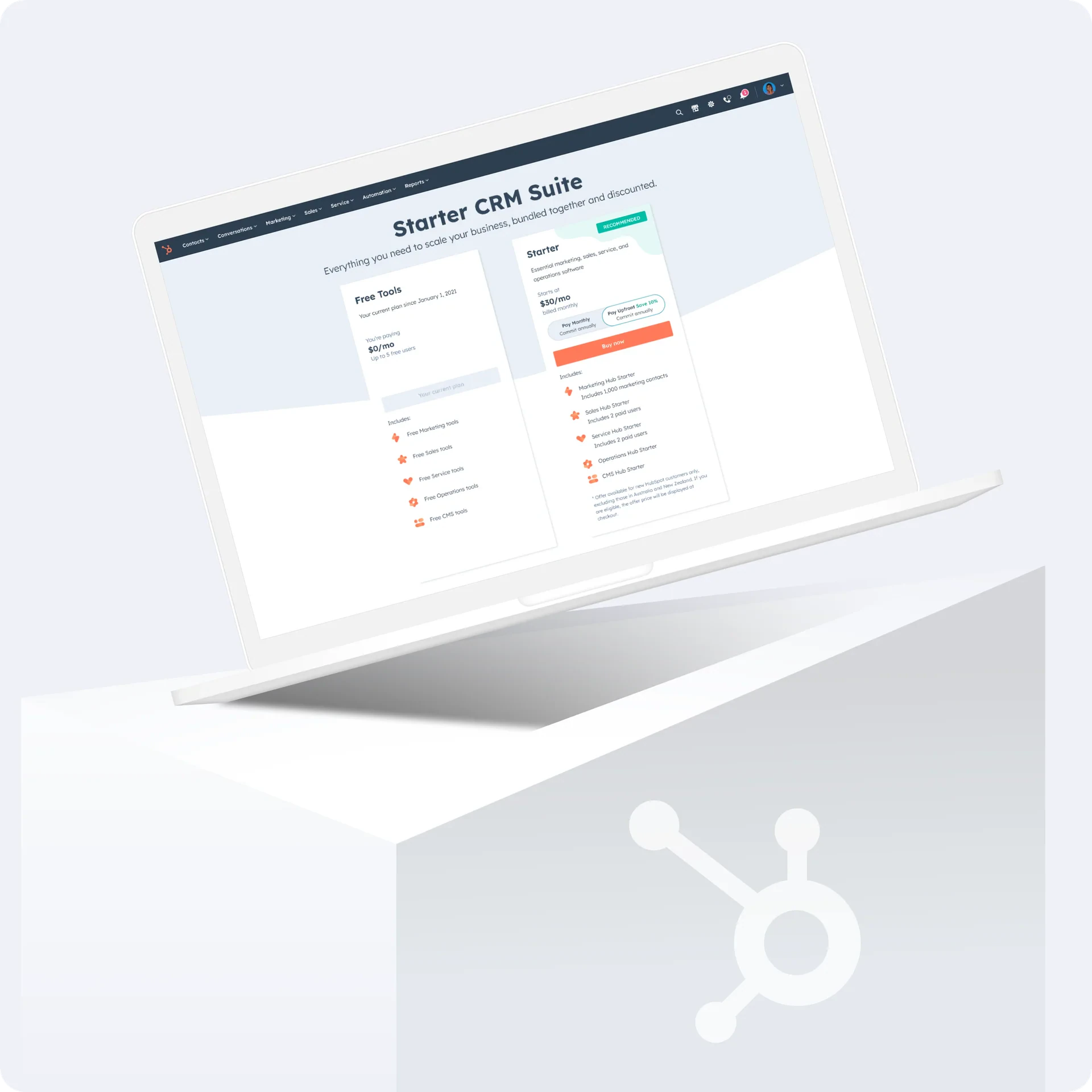
Replaced a confusing pricing-page detour with one targeted upgrade page, lifting Starter purchases 41.3% among small teams
- My role
- Product designer, Growth: pricing and monetization
- Timeline
- HubSpot, 2022–2025
- Scale
- HubSpot’s free-to-Starter upgrade path
- All free users hitting a locked Starter feature
- Tools
- Figma
- Amplitude
- Platform
- SaaS web application (in-app upgrade)
Free users wanted to upgrade, but the path dropped them onto a pricing page full of options
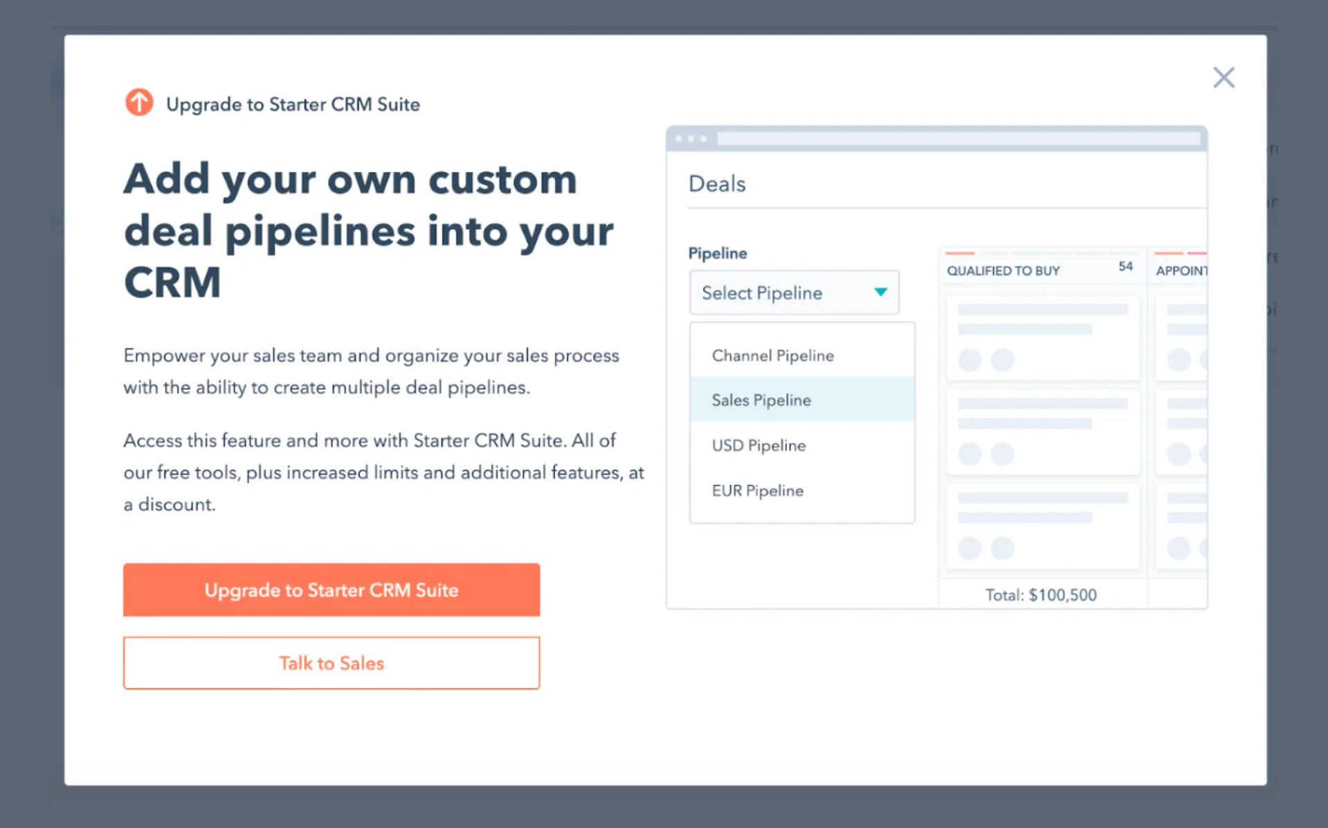
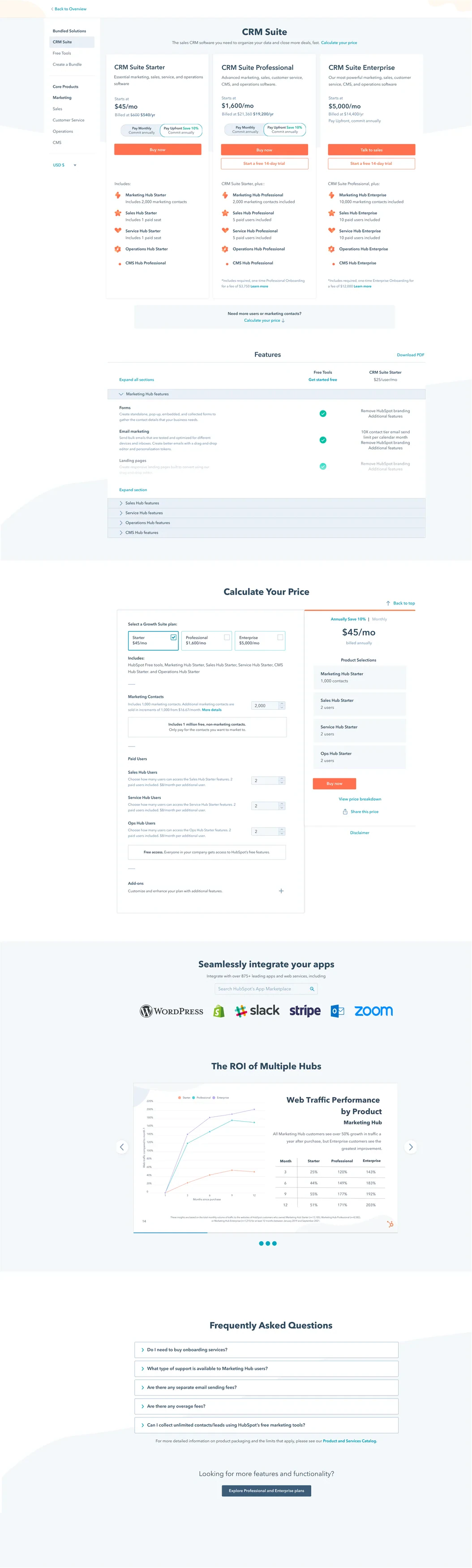
When a free user clicked a locked feature, an upgrade modal pitched the Starter CRM Suite, then sent them to the full pricing page with every tier on it.
Getting more free users to Starter is one of the biggest revenue levers for HubSpot’s Growth team, so a confusing path here cost real money.
Research showed me exactly where people got lost
Our upgrade strategy research pointed to three questions people could not answer on their own.
Which tier do I need?
Jumping from the modal to the pricing page left people unsure which tier unlocked the feature they wanted.
Suite or single product?
Multiple plan options with no clear recommendation for the cheapest way to get the feature.
What do I get over Free?
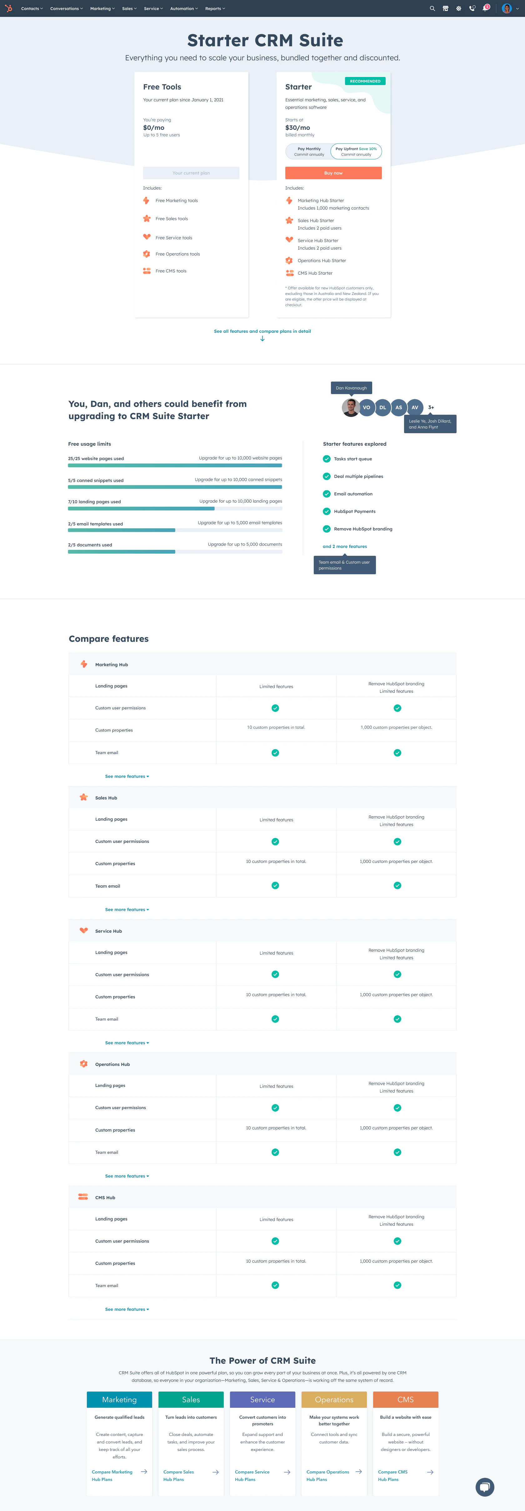
There was no simple way to compare Free with Starter, so teams of 1–5 people often contacted sales just to ask.
So I designed one targeted page that answers those questions in place
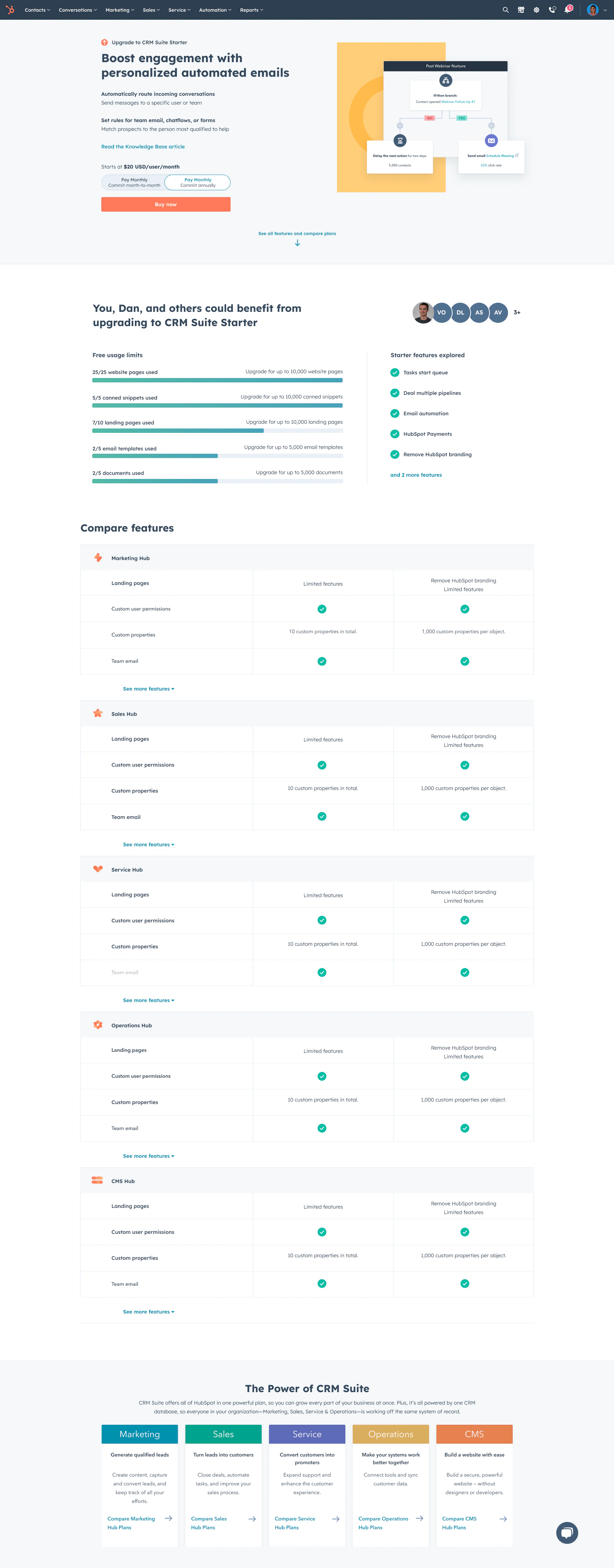
My hypothesis: if the in-app experience recommends the Starter CRM Suite directly and shows exactly what changes from Free, people will feel confident they found the right product, ask fewer questions, and buy.
The experiment won, so we shipped it to everyone
More free users became paying Starter customers overall.
Teams under 5 users, the ones who used to call sales, bought on their own.
The lift held in our largest market.
Then I removed the modal entirely and put feature details right on the upgrade page
Building on the win, we productized the approach and kept experimenting: one page, no extra step, with the features people care about explained in place.
This project taught me that recommending is kinder than offering every option
What I learned
- A clear recommendation reduces questions more than more information does
What I stopped doing
- Sending people to a general page when they already told us what they want
What I do now
- I design upgrade moments around the feature that triggered them