Rite Aid’s digital refresh: from branding to a design system
Built Rite Aid’s first design system and used it to redesign key pages, lifting product-page conversion 23.4%
- My role
- Lead UX designer for the design system and top-of-funnel page redesigns
- Timeline
- Rite Aid, 2020–2022
- Scale
- RiteAid.com and the Rite Aid app
- Part of the company-wide RxEvolution rebrand
- Team
- 2 full-time designers I managed
- Offshore team: 2 designers, 1 researcher
- Product, tech, and marketing
- Tools
- Figma
- HTML and CSS (with engineering)
- Platform
- Responsive web + app
Rite Aid was rebranding as a whole-health destination, and its website still looked like a traditional pharmacy
Rite Aid’s RxEvolution strategy set out to treat mind, body, and spirit, with a focus on Millennial and Gen X women caring for themselves, their kids, aging parents, and even pets.
The challenge: create a unified, modern, easy-to-use RiteAid.com that speaks to the new goals and audience, without alienating existing customers.
So I started by talking to the new audience about their day-to-day and the pain of managing family pharmacy needs online
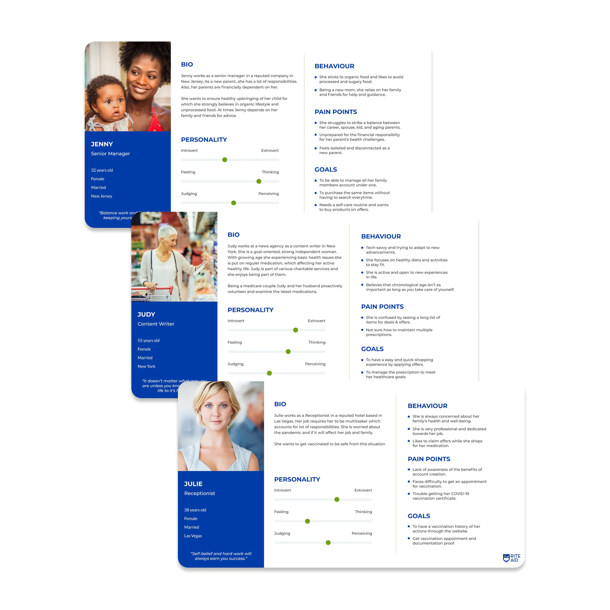
Casual interviews about shopping and pharmacy tasks became three personas we used on every project after: Jenny the “Juggler,” a new parent supporting her parents; Judy the “Nester,” managing regular medication; and Julie the “Transactional,” who just wants to get vaccinated.
With a long roadmap and no single source of truth, I ran a design sprint to decide what to build first
Product, tech, marketing, developers, and UX agreed on version 1.0: a scalable visual language plus the atomic components most often reused and combined into modules and landing pages.
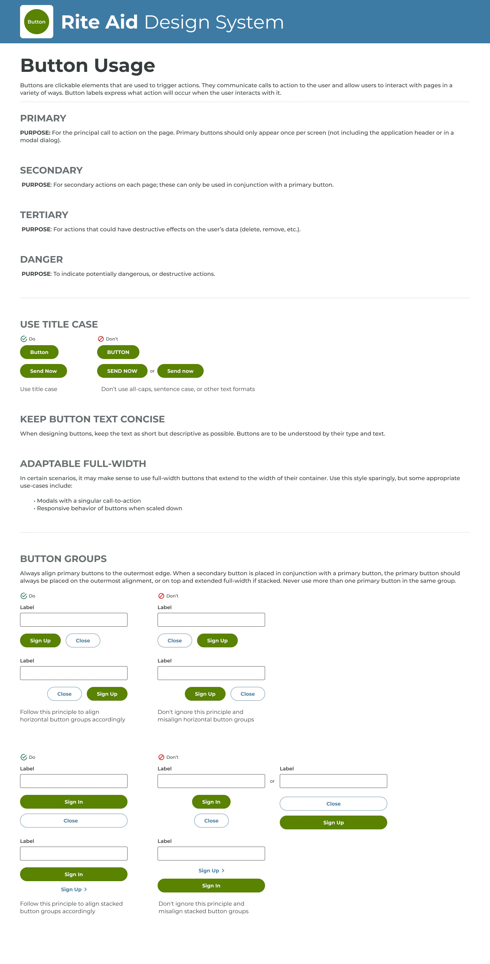
- Components: actionable elements used over and over, like buttons, inputs, selections, and tooltips
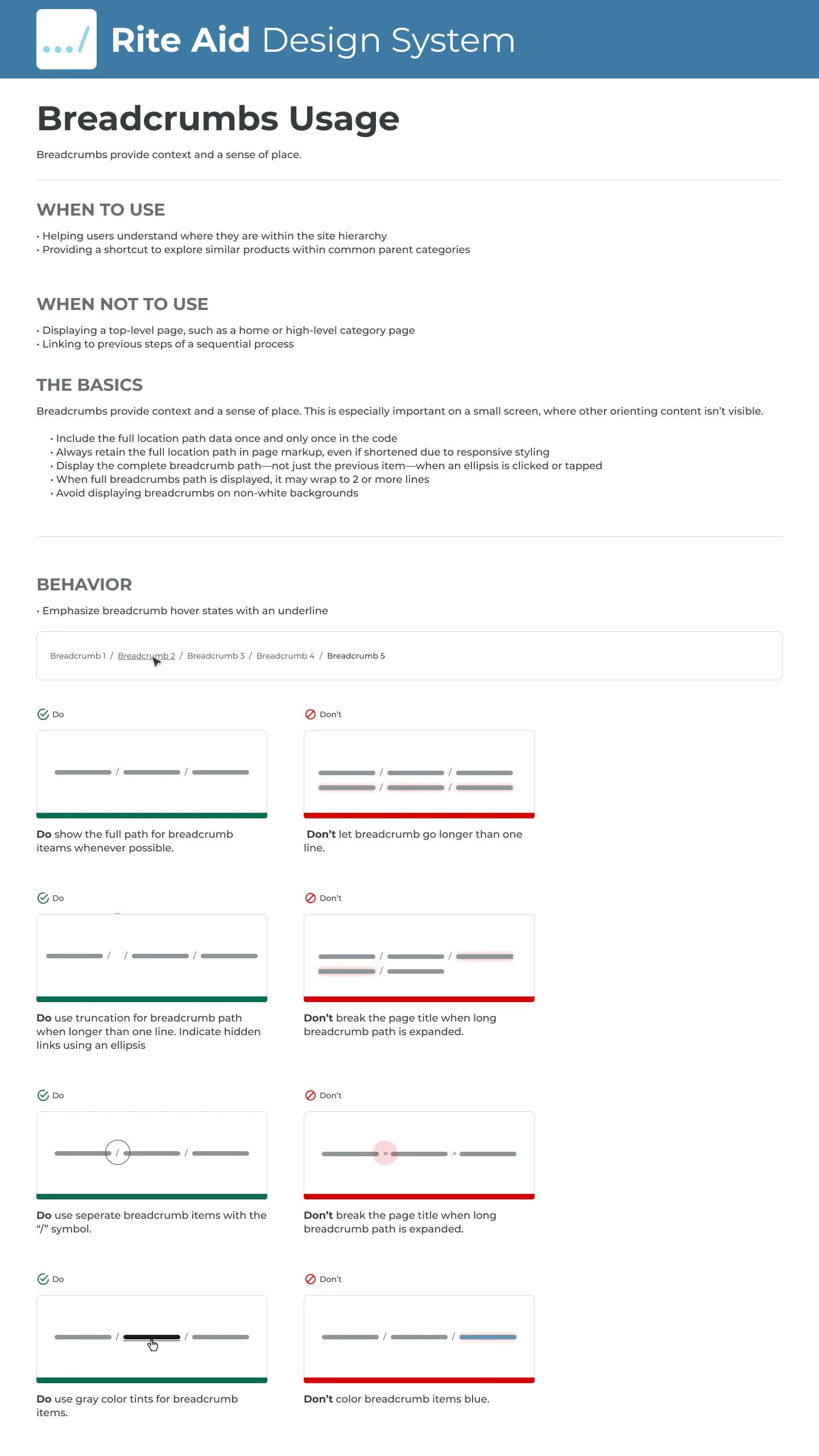
- Modules: combinations of components we can reuse and rearrange across pages
- Aligning every team on that difference was critical to the system’s success
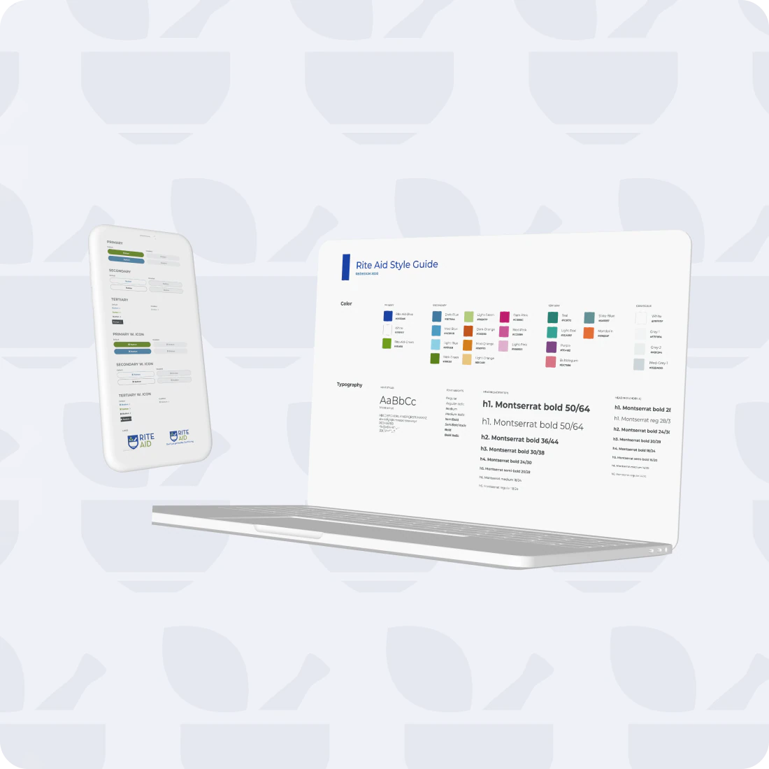
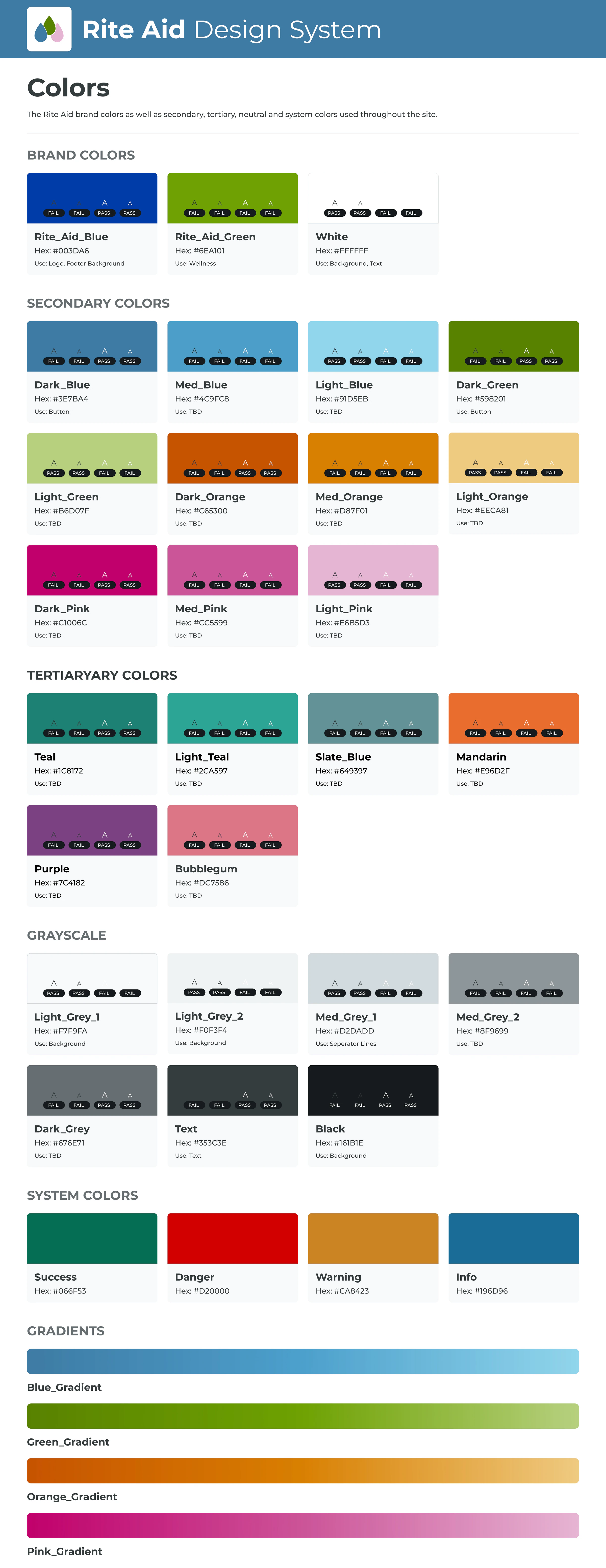
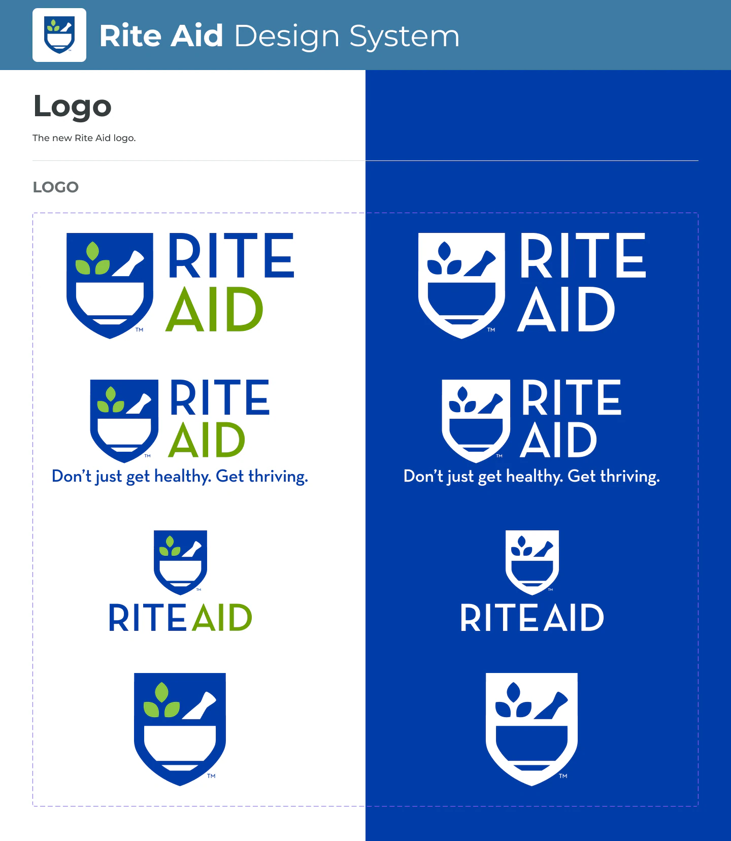
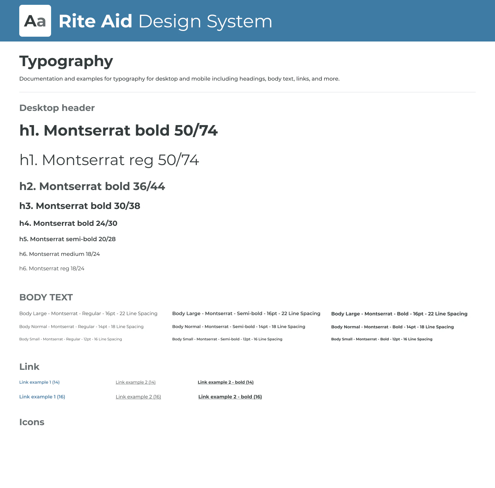
Then I built the foundation: a color palette that meets accessibility standards, type, logo usage, and core components
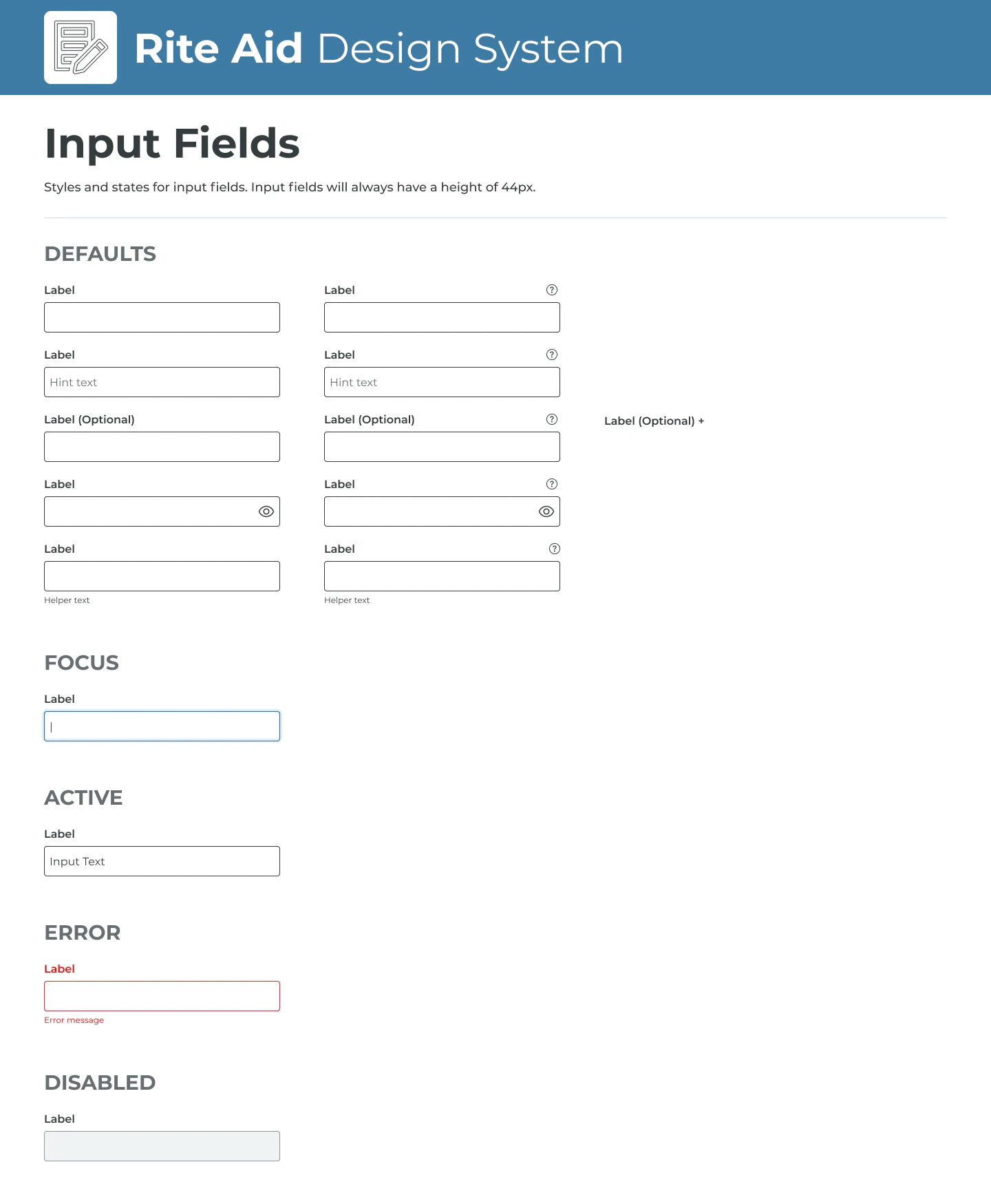
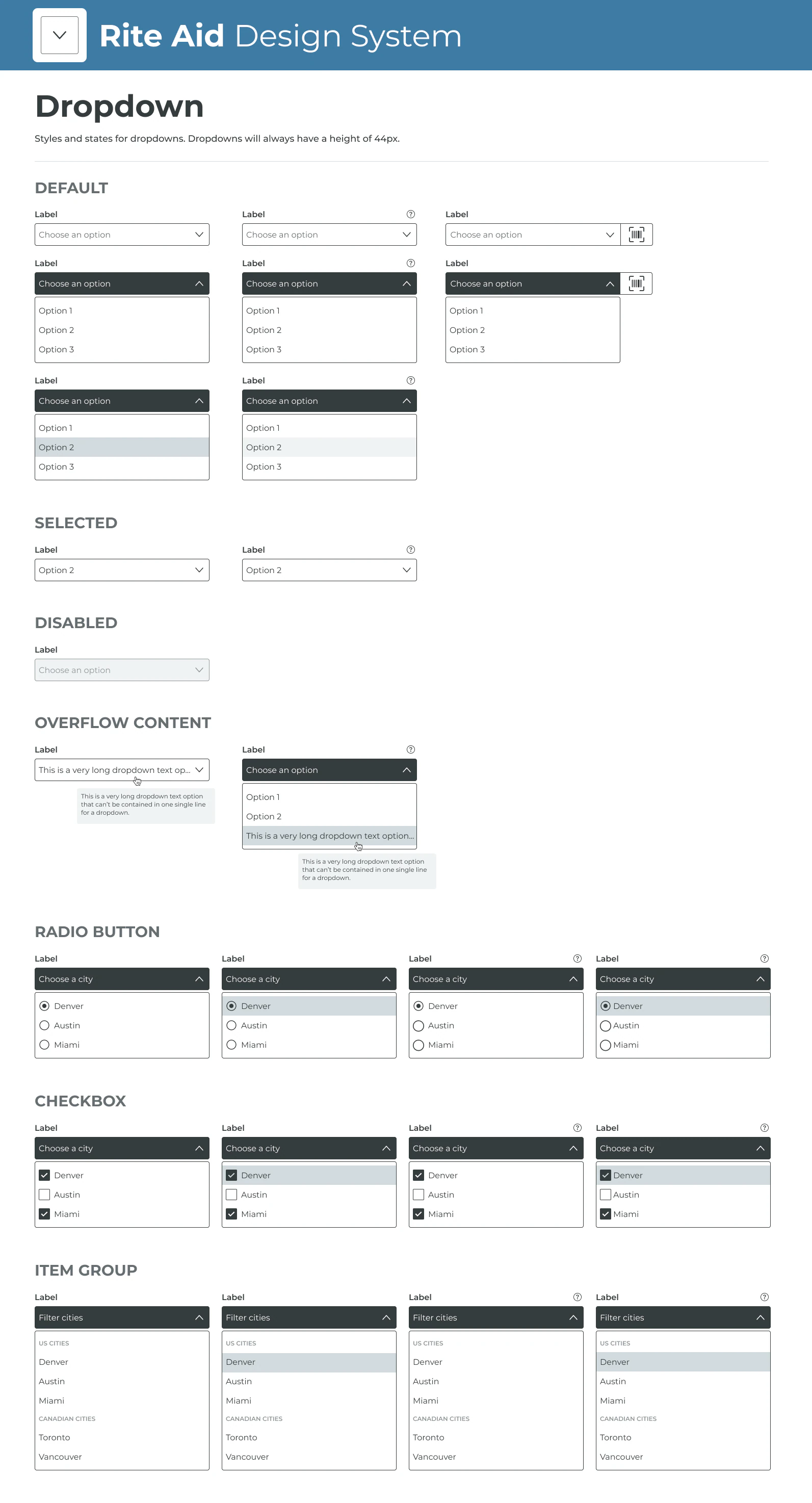
Then we put the system to work on the three pages that mattered most
We redesigned the home page, the product details page, and the beauty category page: brighter and more modern, with helpful content and quizzes that personalize what people shop.










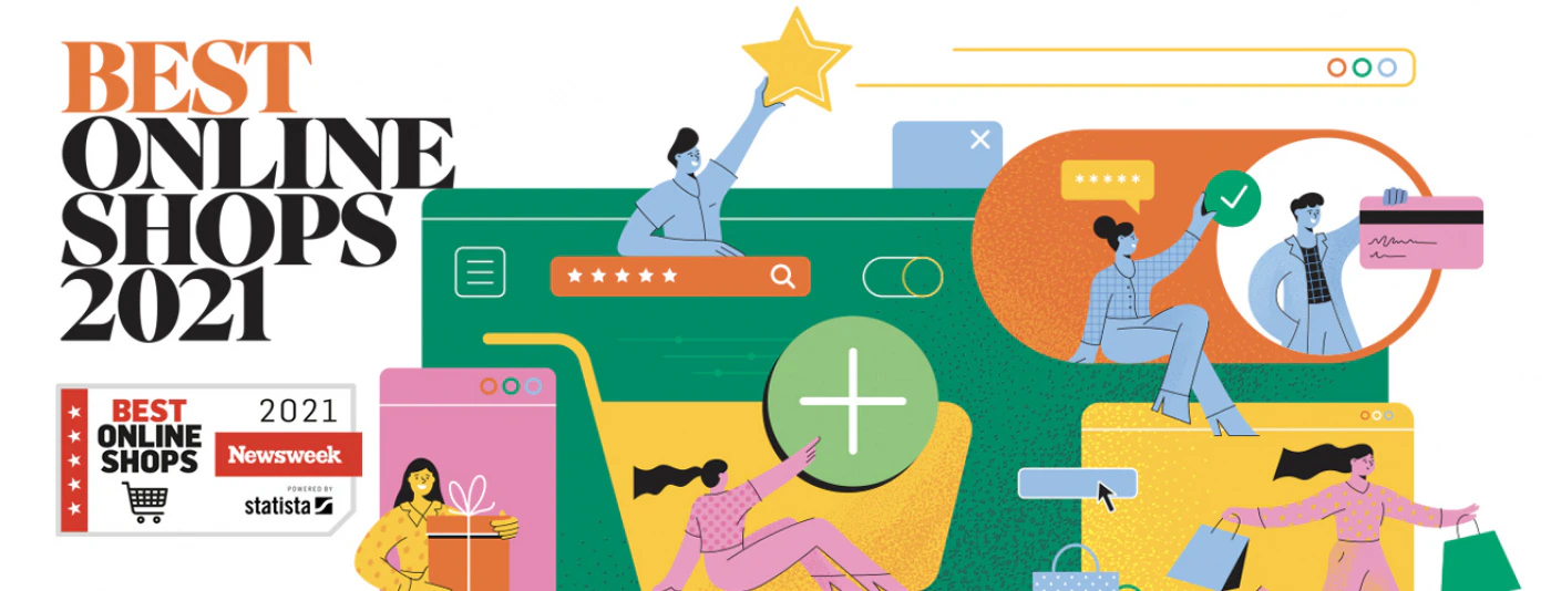
After launch, people shopped more and Newsweek noticed
Clearer product pages turned more visits into purchases.
People clicked further into the category we redesigned around discovery.
Personalized recommendations became a real path to purchase.
Across the whole site, not just the redesigned pages.
I made the system something every team could build with
Engineering
Owned the design system engineering used across web and app, with the goal of encoding it in HTML and CSS.
My designers
Managed 2 full-time designers and directed an offshore team: set priorities, ran critique, supported their growth.
Agency partners
Managed external agencies so campaigns stayed on brand.
Product teams
Legacy products adopt the system as they update; new products start with it.
- Built the color palette to meet AA accessibility requirements
- Documented components for internal and external partners